WORK
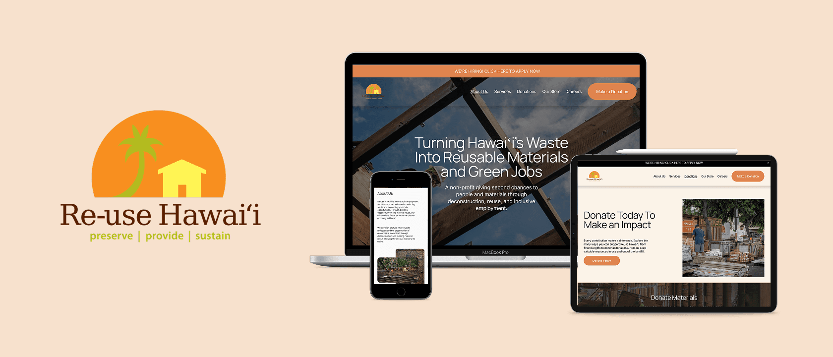

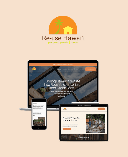
Redesigning for Growth: Reuse Hawaii's Path to Discoverability
Redesigning for Growth: Reuse Hawaii's Path to Discoverability
WORKFLOW
Market Research
Research Interviews
User Personas & User Flows
Design
Iterative Process
SEO Strategy
Design System
Final UI
TEAM
Jozz Gomez- Product Designer & Digital Strategist
Renée Thorp -Communications and Marketing Manager
Mariane Uehara
Director of Fundraising & Strategic Communications
TIME
2025-2026
8 weeks
SECTOR
Non-profit
Jump to Final UI
Fix the Foundation First
Re-use Hawaiʻi is a nonprofit reducing construction waste across the Hawaiian islands, connecting communities with salvaged materials while supporting sustainability and local jobs.
With their 20th anniversary on the horizon and paid media investment planned, they needed a website that could do more: clearer services, less friction, and the credibility to convert. I led the redesign as Product Designer and Digital Strategist, working directly with the core team to align design decisions with growth goals.
Fix the Foundation First
Re-use Hawaiʻi is a nonprofit reducing construction waste across the Hawaiian islands, connecting communities with salvaged materials while supporting sustainability and local jobs.
With their 20th anniversary on the horizon and paid media investment planned, they needed a website that could do more: clearer services, less friction, and the credibility to convert. I led the redesign as Product Designer and Digital Strategist, working directly with the core team to align design decisions with growth goals.
Fix the Foundation First
Re-use Hawaiʻi is a nonprofit reducing construction waste across the Hawaiian islands, connecting communities with salvaged materials while supporting sustainability and local jobs.
With their 20th anniversary on the horizon and paid media investment planned, they needed a website that could do more: clearer services, less friction, and the credibility to convert. I led the redesign as Product Designer and Digital Strategist, working directly with the core team to align design decisions with growth goals.

Homepage

Deconstruction

Donations (section)

Homepage
Homepage
Homepage

Deconstruction

Donations (section)
A Mission Hidden Behind Complexity
Reuse Hawaiʻi operated across a wide range of services including deconstruction, tree milling, a physical store, and workforce development programs. Yet their digital presence failed to communicate that ecosystem. Visitors left without understanding what the nonprofit truly offered, monetary donations went unnoticed, and deconstruction inquiries were lower than expected.
The site's structure wasn't helping. Unclear navigation and fragmented user flows made key actions difficult to discover, while inconsistent UI elements weakened trust and brand clarity.
Built and maintained by a non-technical team, the site had served its purpose. But with new milestones and investment approaching, the digital experience needed to catch up with the scale of the organization's mission.
A Mission Hidden Behind Complexity
Reuse Hawaiʻi operated across a wide range of services including deconstruction, tree milling, a physical store, and workforce development programs. Yet their digital presence failed to communicate that ecosystem. Visitors left without understanding what the nonprofit truly offered, monetary donations went unnoticed, and deconstruction inquiries were lower than expected.
The site's structure wasn't helping. Unclear navigation and fragmented user flows made key actions difficult to discover, while inconsistent UI elements weakened trust and brand clarity.
Built and maintained by a non-technical team, the site had served its purpose. But with new milestones and investment approaching, the digital experience needed to catch up with the scale of the organization's mission.
A Mission Hidden Behind Complexity
Reuse Hawaiʻi operated across a wide range of services including deconstruction, tree milling, a physical store, and workforce development programs. Yet their digital presence failed to communicate that ecosystem. Visitors left without understanding what the nonprofit truly offered, monetary donations went unnoticed, and deconstruction inquiries were lower than expected.
The site's structure wasn't helping. Unclear navigation and fragmented user flows made key actions difficult to discover, while inconsistent UI elements weakened trust and brand clarity.
Built and maintained by a non-technical team, the site had served its purpose. But with new milestones and investment approaching, the digital experience needed to catch up with the scale of the organization's mission.

Deconstruction in Hawaiʻi: The Bigger Picture
Hawaiʻi faces significant challenges in managing construction waste, with limited landfill space and a strong reliance on imported building materials. While deconstruction offers a sustainable alternative by recovering materials for reuse, adoption remains low across homeowners and contractors.
The barrier is not demand. It is awareness and understanding. For many potential clients, deconstruction is an unfamiliar process that requires education before consideration.
This created a strategic opportunity. The website needed to function not only as an informational hub, but as a growth engine. By clearly explaining the value, process, and benefits of deconstruction, the digital experience could expand the audience, increase inquiries, and position Reuse Hawaiʻi as a leader in a largely untapped market.
Deconstruction in Hawaiʻi: The Bigger Picture
Hawaiʻi faces significant challenges in managing construction waste, with limited landfill space and a strong reliance on imported building materials. While deconstruction offers a sustainable alternative by recovering materials for reuse, adoption remains low across homeowners and contractors.
The barrier is not demand. It is awareness and understanding. For many potential clients, deconstruction is an unfamiliar process that requires education before consideration.
This created a strategic opportunity. The website needed to function not only as an informational hub, but as a growth engine. By clearly explaining the value, process, and benefits of deconstruction, the digital experience could expand the audience, increase inquiries, and position Reuse Hawaiʻi as a leader in a largely untapped market.
Deconstruction in Hawaiʻi: The Bigger Picture
Hawaiʻi faces significant challenges in managing construction waste, with limited landfill space and a strong reliance on imported building materials. While deconstruction offers a sustainable alternative by recovering materials for reuse, adoption remains low across homeowners and contractors.
The barrier is not demand. It is awareness and understanding. For many potential clients, deconstruction is an unfamiliar process that requires education before consideration.
This created a strategic opportunity. The website needed to function not only as an informational hub, but as a growth engine. By clearly explaining the value, process, and benefits of deconstruction, the digital experience could expand the audience, increase inquiries, and position Reuse Hawaiʻi as a leader in a largely untapped market.
Homepage
Operating as a Nonprofit in Hawai‘i
Operating as a Nonprofit in Hawai‘i


Defining the Strategic Priorities
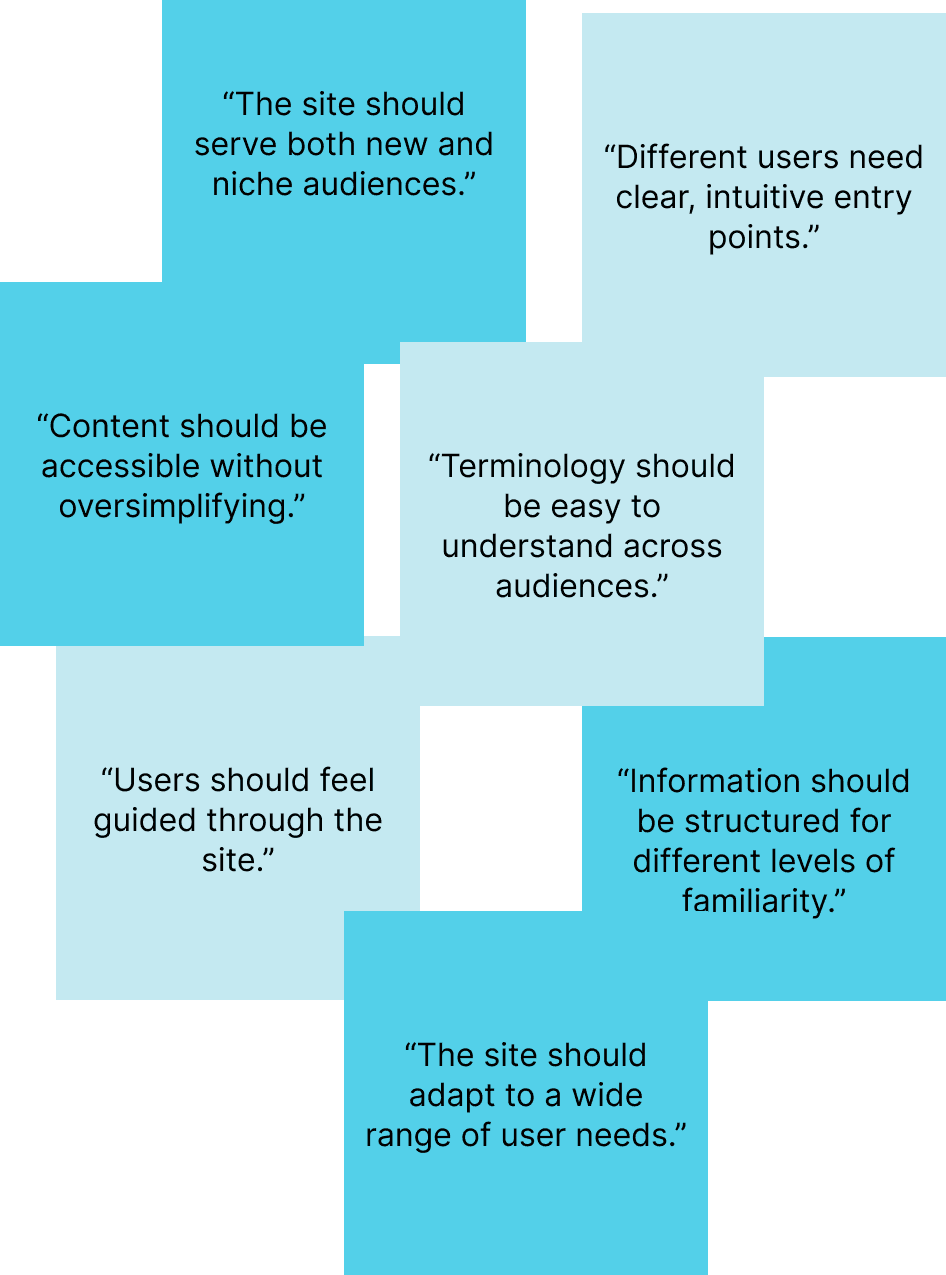
To define a clear direction for the redesign, I facilitated working sessions with leadership, marketing, and operations stakeholders. Each team had different priorities: increasing deconstruction inquiries, improving public awareness, strengthening credibility, and streamlining internal processes.
Through collaborative mapping and clustering exercises, recurring themes emerged. The organization needed to build trust with unfamiliar audiences, improve discoverability through stronger SEO foundations, and create a unified experience that could serve homeowners, contractors, donors, and shoppers without fragmenting the journey.
These conversations reframed the website as more than a communication tool. It needed to support education, drive conversion, and reinforce operational efficiency across the organization.
Defining the Strategic Priorities
To define a clear direction for the redesign, I facilitated working sessions with leadership, marketing, and operations stakeholders. Each team had different priorities: increasing deconstruction inquiries, improving public awareness, strengthening credibility, and streamlining internal processes.
Through collaborative mapping and clustering exercises, recurring themes emerged. The organization needed to build trust with unfamiliar audiences, improve discoverability through stronger SEO foundations, and create a unified experience that could serve homeowners, contractors, donors, and shoppers without fragmenting the journey.
These conversations reframed the website as more than a communication tool. It needed to support education, drive conversion, and reinforce operational efficiency across the organization.
Defining the Strategic Priorities
To define a clear direction for the redesign, I facilitated working sessions with leadership, marketing, and operations stakeholders. Each team had different priorities: increasing deconstruction inquiries, improving public awareness, strengthening credibility, and streamlining internal processes.
Through collaborative mapping and clustering exercises, recurring themes emerged. The organization needed to build trust with unfamiliar audiences, improve discoverability through stronger SEO foundations, and create a unified experience that could serve homeowners, contractors, donors, and shoppers without fragmenting the journey.
These conversations reframed the website as more than a communication tool. It needed to support education, drive conversion, and reinforce operational efficiency across the organization.
1
DESIGN
clear and structured journeys aligned with the motivations of high impact personas.
2
CREATE
consistency across typography, color, and UI components to strengthen trust and brand recognition.
3
Clarify
processes and expectations without compromising detail, supporting decision making across experience levels.
4
OPTIMIZE
calls to action and reduce friction across key revenue touchpoints including inquiries, donations, and store visits.
Credibility, Clarity & Trust
Credibility, Clarity & Trust

Multiple Audiences,
One Experience
Multiple Audiences,
One Experience
Discoverability, SEO & Growth
Discoverability, SEO & Growth

Conversion, Structure &
Sustainability
Conversion, Structure &
Sustainability

User personas
While additional user groups such as in store shoppers were considered, the redesign prioritized the two segments with the highest growth and revenue impact:
Value Driven Renovators
Homeowners and contractors planning renovations or teardowns who are exploring cost effective and responsible alternatives to traditional demolition. While sustainability may be a secondary motivator, cost benefit and logistical clarity strongly influence their decision making.
For this audience, the website must clearly explain the deconstruction process, financial implications, and practical next steps to reduce uncertainty and encourage inquiry.
Impact Driven Donors
These users already understand the mission and language of sustainability initiatives. They often evaluate multiple nonprofits within limited time and are looking for transparency, credibility, and measurable impact. Clear communication of outcomes, financial accountability, and community impact are essential to earning their trust and support.
User personas
While additional user groups such as in store shoppers were considered, the redesign prioritized the two segments with the highest growth and revenue impact:
Value Driven Renovators
Homeowners and contractors planning renovations or teardowns who are exploring cost effective and responsible alternatives to traditional demolition. While sustainability may be a secondary motivator, cost benefit and logistical clarity strongly influence their decision making.
For this audience, the website must clearly explain the deconstruction process, financial implications, and practical next steps to reduce uncertainty and encourage inquiry.
Impact Driven Donors
These users already understand the mission and language of sustainability initiatives. They often evaluate multiple nonprofits within limited time and are looking for transparency, credibility, and measurable impact. Clear communication of outcomes, financial accountability, and community impact are essential to earning their trust and support.
User personas
While additional user groups such as in store shoppers were considered, the redesign prioritized the two segments with the highest growth and revenue impact:
Value Driven Renovators
Homeowners and contractors planning renovations or teardowns who are exploring cost effective and responsible alternatives to traditional demolition. While sustainability may be a secondary motivator, cost benefit and logistical clarity strongly influence their decision making.
For this audience, the website must clearly explain the deconstruction process, financial implications, and practical next steps to reduce uncertainty and encourage inquiry.
Impact Driven Donors
These users already understand the mission and language of sustainability initiatives. They often evaluate multiple nonprofits within limited time and are looking for transparency, credibility, and measurable impact. Clear communication of outcomes, financial accountability, and community impact are essential to earning their trust and support.


Translating Insight into Strategy
Following research and cross functional alignment, four strategic principles were established to guide the redesign. Each decision across structure, content, and SEO was grounded in these pillars to ensure clarity, credibility, and growth.
Translating Insight into Strategy
Following research and cross functional alignment, four strategic principles were established to guide the redesign. Each decision across structure, content, and SEO was grounded in these pillars to ensure clarity, credibility, and growth.
Translating Insight into Strategy
Following research and cross functional alignment, four strategic principles were established to guide the redesign. Each decision across structure, content, and SEO was grounded in these pillars to ensure clarity, credibility, and growth.
1
DESIGN
DESIGN
clear and structured journeys aligned with the motivations of high impact personas.
clear and structured journeys aligned with the motivations of high impact personas.
2
CREATE
CREATE
consistency across typography, color, and UI components to strengthen trust and brand recognition.
consistency across typography, color, and UI components to strengthen trust and brand recognition.
3
Clarify
Clarify
processes and expectations without compromising detail, supporting decision making across experience levels.
processes and expectations without compromising detail, supporting decision making across experience levels.
4
OPTIMIZE
OPTIMIZE
calls to action and reduce friction across key revenue touchpoints including inquiries, donations, and store visits.
calls to action and reduce friction across key revenue touchpoints including inquiries, donations, and store visits.
Structuring High Impact Journeys
I mapped task based user flows for the two highest impact scenarios: securing deconstruction inquiries and generating corporate sponsorship interest.
The original pages asked users to commit before clearly communicating value. Deconstruction led with an inquiry form without explaining the process or its benefits, while corporate sponsorship presented tier levels without articulating impact, credibility, or measurable outcomes.
The redesigned flows introduced a structured progression where clear value framing, impact signals, and contextual education were layered before deeper commitment points.
Structuring High Impact Journeys
I mapped task based user flows for the two highest impact scenarios: securing deconstruction inquiries and generating corporate sponsorship interest.
The original pages asked users to commit before clearly communicating value. Deconstruction led with an inquiry form without explaining the process or its benefits, while corporate sponsorship presented tier levels without articulating impact, credibility, or measurable outcomes.
The redesigned flows introduced a structured progression where clear value framing, impact signals, and contextual education were layered before deeper commitment points.
Structuring High Impact Journeys
I mapped task based user flows for the two highest impact scenarios: securing deconstruction inquiries and generating corporate sponsorship interest.
The original pages asked users to commit before clearly communicating value. Deconstruction led with an inquiry form without explaining the process or its benefits, while corporate sponsorship presented tier levels without articulating impact, credibility, or measurable outcomes.
The redesigned flows introduced a structured progression where clear value framing, impact signals, and contextual education were layered before deeper commitment points.


Low Fidelity: Explorations
The homepage was positioned as the primary entry point to communicate the organization’s mission in a way that felt accessible, credible, and grounded in Hawaiian values without appearing performative. Existing brand materials required the continued use of core colors, shaping early visual constraints.
Multiple layout systems were tested to improve hierarchy, reduce fragmentation, and clarify key pathways. Dedicated overview pages were introduced to distinguish donation types including materials, tree sponsorship, and monetary contributions, allowing each to expand into deeper content. These explorations established information flow and content sequencing, which were refined and validated in the next design phase.
Low Fidelity: Explorations
The homepage was positioned as the primary entry point to communicate the organization’s mission in a way that felt accessible, credible, and grounded in Hawaiian values without appearing performative. Existing brand materials required the continued use of core colors, shaping early visual constraints.
Multiple layout systems were tested to improve hierarchy, reduce fragmentation, and clarify key pathways. Dedicated overview pages were introduced to distinguish donation types including materials, tree sponsorship, and monetary contributions, allowing each to expand into deeper content. These explorations established information flow and content sequencing, which were refined and validated in the next design phase.
Low Fidelity: Explorations
The homepage was positioned as the primary entry point to communicate the organization’s mission in a way that felt accessible, credible, and grounded in Hawaiian values without appearing performative. Existing brand materials required the continued use of core colors, shaping early visual constraints.
Multiple layout systems were tested to improve hierarchy, reduce fragmentation, and clarify key pathways. Dedicated overview pages were introduced to distinguish donation types including materials, tree sponsorship, and monetary contributions, allowing each to expand into deeper content. These explorations established information flow and content sequencing, which were refined and validated in the next design phase.
Homepage
Exploring how to establish a strong first impression that reflects the organization’s mission and culture.

Exploring how different donation and sponsorship options can be clearly distinguished.
Donation types


Visual Hierarchy
Exploring ways to break down complex information into scannable, visual sections.

Homepage
Homepage
Visual Hierarchy
Visual Hierarchy
Donation types
Donation types
Exploring how to establish a strong first impression that reflects the organization’s mission and culture.
Exploring how to establish a strong first impression that reflects the organization’s mission and culture.
Exploring ways to break down complex information into scannable, visual sections.
Exploring ways to break down complex information into scannable, visual sections.
Exploring how different donation and sponsorship options can be clearly distinguished.
Exploring how different donation and sponsorship options can be clearly distinguished.
Feedback Loop and Iteration
Following the first low fidelity prototypes, collaborative review sessions were held to evaluate messaging, structure, and brand positioning.
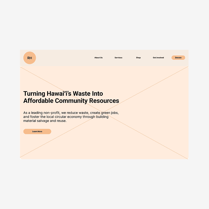
Leadership emphasized the importance of clearly communicating nonprofit status early in the experience, leading to adjustments in the hero section and interface copy to strengthen credibility. There was also a strategic push to move beyond the perception of being solely construction focused by highlighting the human impact of the organization through more prominent community imagery and storytelling elements.
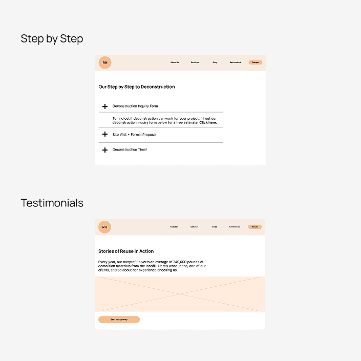
Informational guidelines and step by step processes were reorganized into expandable sections to maintain accessibility while preventing visual overload. The most significant iteration involved consolidating all donation types into a single, centralized page rather than separating them across multiple overviews. This shift reduced navigation friction, improved decision making clarity, and allowed users to compare options more efficiently.
Feedback Loop and Iteration
Following the first low fidelity prototypes, collaborative review sessions were held to evaluate messaging, structure, and brand positioning.
Leadership emphasized the importance of clearly communicating nonprofit status early in the experience, leading to adjustments in the hero section and interface copy to strengthen credibility. There was also a strategic push to move beyond the perception of being solely construction focused by highlighting the human impact of the organization through more prominent community imagery and storytelling elements.
Informational guidelines and step by step processes were reorganized into expandable sections to maintain accessibility while preventing visual overload. The most significant iteration involved consolidating all donation types into a single, centralized page rather than separating them across multiple overviews. This shift reduced navigation friction, improved decision making clarity, and allowed users to compare options more efficiently.
Feedback Loop and Iteration
Following the first low fidelity prototypes, collaborative review sessions were held to evaluate messaging, structure, and brand positioning.
Leadership emphasized the importance of clearly communicating nonprofit status early in the experience, leading to adjustments in the hero section and interface copy to strengthen credibility. There was also a strategic push to move beyond the perception of being solely construction focused by highlighting the human impact of the organization through more prominent community imagery and storytelling elements.
Informational guidelines and step by step processes were reorganized into expandable sections to maintain accessibility while preventing visual overload. The most significant iteration involved consolidating all donation types into a single, centralized page rather than separating them across multiple overviews. This shift reduced navigation friction, improved decision making clarity, and allowed users to compare options more efficiently.
Homepage

Feedback
Feedback
Proposal
Proposal
Deconstruction Page

Feedback
Feedback
Proposal
Proposal
Donations Page

Feedback
Feedback
Proposal
Proposal
Integrating SEO into Product Strategy
Like any structure, a strong facade is not enough without a solid foundation. Beyond the visual redesign, search performance was essential to ensuring the website could sustainably support awareness and growth.
A comprehensive SEO audit revealed structural gaps limiting discoverability and conversion potential. Improvements focused on refining heading hierarchy, clarifying page intent, strengthening accessibility, and establishing a keyword framework to guide UX writing.
Within two months, the homepage improved its ranking position by six places, bounce rate decreased by three percentage points, and new commercial and transactional keywords began ranking, signaling measurable progress in attracting higher intent audiences.
Integrating SEO into Product Strategy
Like any structure, a strong facade is not enough without a solid foundation. Beyond the visual redesign, search performance was essential to ensuring the website could sustainably support awareness and growth.
A comprehensive SEO audit revealed structural gaps limiting discoverability and conversion potential. Improvements focused on refining heading hierarchy, clarifying page intent, strengthening accessibility, and establishing a keyword framework to guide UX writing.
Within two months, the homepage improved its ranking position by six places, bounce rate decreased by three percentage points, and new commercial and transactional keywords began ranking, signaling measurable progress in attracting higher intent audiences.
Integrating SEO into Product Strategy
Like any structure, a strong facade is not enough without a solid foundation. Beyond the visual redesign, search performance was essential to ensuring the website could sustainably support awareness and growth.
A comprehensive SEO audit revealed structural gaps limiting discoverability and conversion potential. Improvements focused on refining heading hierarchy, clarifying page intent, strengthening accessibility, and establishing a keyword framework to guide UX writing.
Within two months, the homepage improved its ranking position by six places, bounce rate decreased by three percentage points, and new commercial and transactional keywords began ranking, signaling measurable progress in attracting higher intent audiences.

Design System Foundations
The style guide was developed to honor Reuse Hawaiʻi’s existing brand foundations while evolving the visual system into a more modern, readable, and accessible experience grounded in local culture and community values.
Manrope and Inter were selected for their clarity, versatility, and strong digital performance across devices. The color system refined the organization’s existing orange into more accessible tonal variations while introducing structured accent colors primarily applied through imagery and key interaction points. A cohesive iconography system was also established to visually represent core organizational values and clearly differentiate sponsorship engagement levels.
Design System Foundations
The style guide was developed to honor Reuse Hawaiʻi’s existing brand foundations while evolving the visual system into a more modern, readable, and accessible experience grounded in local culture and community values.
Manrope and Inter were selected for their clarity, versatility, and strong digital performance across devices. The color system refined the organization’s existing orange into more accessible tonal variations while introducing structured accent colors primarily applied through imagery and key interaction points. A cohesive iconography system was also established to visually represent core organizational values and clearly differentiate sponsorship engagement levels.
Design System Foundations
The style guide was developed to honor Reuse Hawaiʻi’s existing brand foundations while evolving the visual system into a more modern, readable, and accessible experience grounded in local culture and community values.
Manrope and Inter were selected for their clarity, versatility, and strong digital performance across devices. The color system refined the organization’s existing orange into more accessible tonal variations while introducing structured accent colors primarily applied through imagery and key interaction points. A cohesive iconography system was also established to visually represent core organizational values and clearly differentiate sponsorship engagement levels.

Design Outcomes Across Core Journeys
Homepage
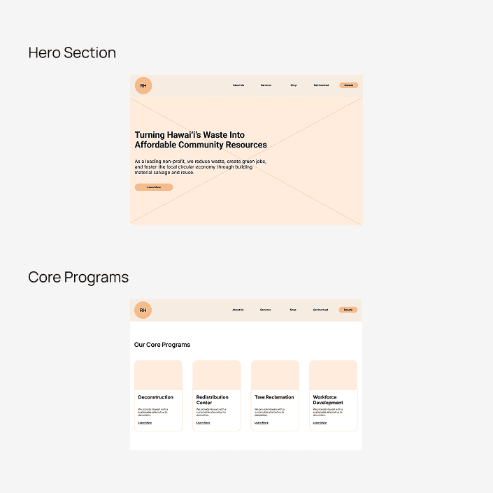
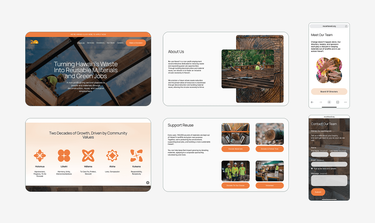
The original homepage prioritized operational information such as hours, location, and services, but lacked narrative direction and strategic hierarchy. The redesigned homepage reframes the experience as an invitation to engage. A mission led hero section establishes purpose immediately, while a strategically placed donation call to action in the navigation ensures high visibility and easy access for users ready to contribute.
Rather than relying on traditional nonprofit layouts, the page introduces a structured narrative that communicates what the organization does, the local values it aligns with, and how it serves the community through four core programs. Modular card sections guide users to deeper content, impact highlights build credibility, and integrated contact opportunities encourage continued engagement. The result is a more welcoming, cohesive, and action oriented entry point.
Homepage
The original homepage prioritized operational information such as hours, location, and services, but lacked narrative direction and strategic hierarchy. The redesigned homepage reframes the experience as an invitation to engage. A mission led hero section establishes purpose immediately, while a strategically placed donation call to action in the navigation ensures high visibility and easy access for users ready to contribute.
Rather than relying on traditional nonprofit layouts, the page introduces a structured narrative that communicates what the organization does, the local values it aligns with, and how it serves the community through four core programs. Modular card sections guide users to deeper content, impact highlights build credibility, and integrated contact opportunities encourage continued engagement. The result is a more welcoming, cohesive, and action oriented entry point.
Homepage
The original homepage prioritized operational information such as hours, location, and services, but lacked narrative direction and strategic hierarchy. The redesigned homepage reframes the experience as an invitation to engage. A mission led hero section establishes purpose immediately, while a strategically placed donation call to action in the navigation ensures high visibility and easy access for users ready to contribute.
Rather than relying on traditional nonprofit layouts, the page introduces a structured narrative that communicates what the organization does, the local values it aligns with, and how it serves the community through four core programs. Modular card sections guide users to deeper content, impact highlights build credibility, and integrated contact opportunities encourage continued engagement. The result is a more welcoming, cohesive, and action oriented entry point.
Deconstruction
The deconstruction page was restructured to shift from immediate inquiry to value driven narrative. A clear hero section now introduces the service with context and positioning before guiding users through benefits, real project examples, and supporting testimonials. “Projects of Every Size” expands perceived accessibility, signaling that the organization can serve both individual homeowners and larger contractors.
Complex processes and guidelines were reorganized into expandable sections, preserving depth for informed audiences while reducing visual overload for new visitors. A dedicated value section clearly articulates the environmental and economic advantages of deconstruction, strengthening differentiation and encouraging informed action.
Deconstruction
The deconstruction page was restructured to shift from immediate inquiry to value driven narrative. A clear hero section now introduces the service with context and positioning before guiding users through benefits, real project examples, and supporting testimonials. “Projects of Every Size” expands perceived accessibility, signaling that the organization can serve both individual homeowners and larger contractors.
Complex processes and guidelines were reorganized into expandable sections, preserving depth for informed audiences while reducing visual overload for new visitors. A dedicated value section clearly articulates the environmental and economic advantages of deconstruction, strengthening differentiation and encouraging informed action.
Deconstruction
The deconstruction page was restructured to shift from immediate inquiry to value driven narrative. A clear hero section now introduces the service with context and positioning before guiding users through benefits, real project examples, and supporting testimonials. “Projects of Every Size” expands perceived accessibility, signaling that the organization can serve both individual homeowners and larger contractors.
Complex processes and guidelines were reorganized into expandable sections, preserving depth for informed audiences while reducing visual overload for new visitors. A dedicated value section clearly articulates the environmental and economic advantages of deconstruction, strengthening differentiation and encouraging informed action.

Donations
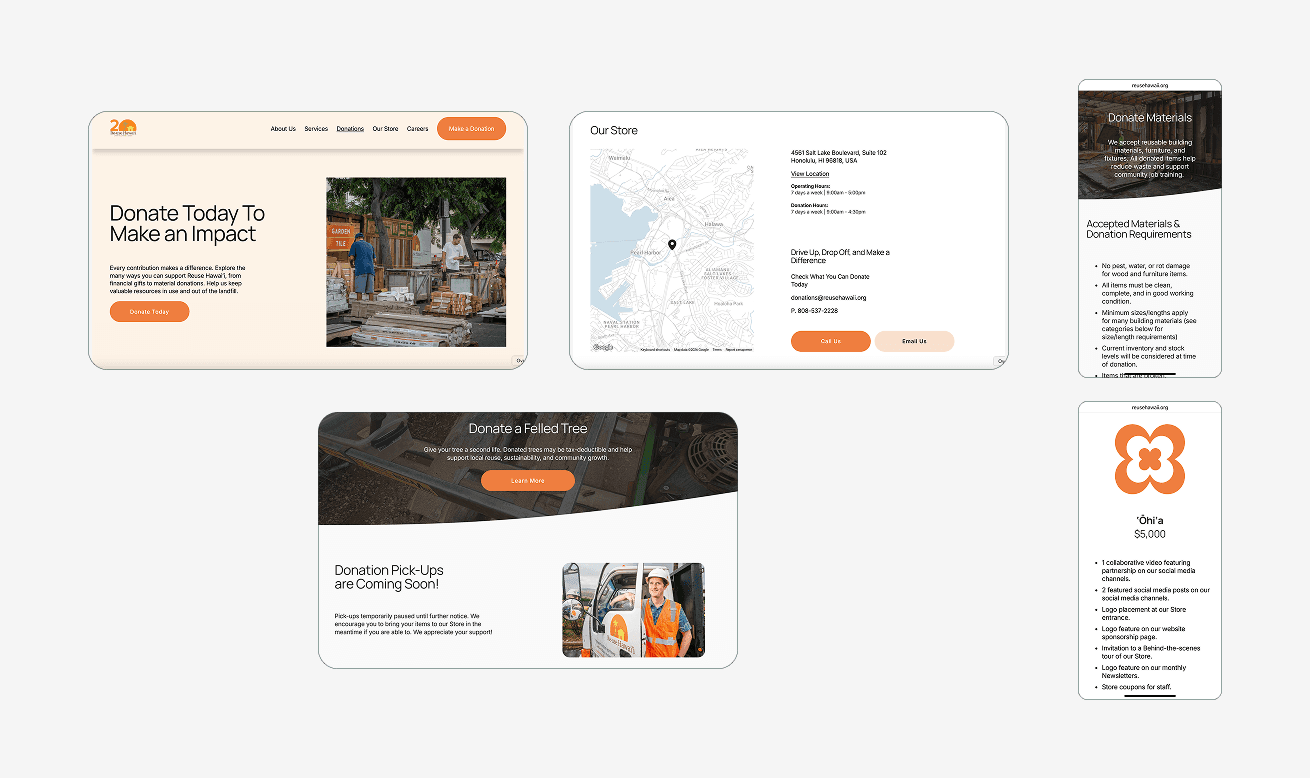
The donations experience was redesigned to address fragmentation across monetary, material, and tree contributions. Instead of separating pathways across multiple pages, the new structure presents all options within a single, clearly organized experience, allowing users to compare impact and choose the form of support that best aligns with their intent.
Clear calls to action guide users toward direct contribution, deeper learning, or exploring engagement levels, supporting both high intent donors and exploratory visitors. A structured FAQ section was introduced to address common concerns while strengthening semantic clarity and structured content signals, improving visibility in search features and increasing the likelihood of inclusion in AI generated overviews.
Donations
The donations experience was redesigned to address fragmentation across monetary, material, and tree contributions. Instead of separating pathways across multiple pages, the new structure presents all options within a single, clearly organized experience, allowing users to compare impact and choose the form of support that best aligns with their intent.
Clear calls to action guide users toward direct contribution, deeper learning, or exploring engagement levels, supporting both high intent donors and exploratory visitors. A structured FAQ section was introduced to address common concerns while strengthening semantic clarity and structured content signals, improving visibility in search features and increasing the likelihood of inclusion in AI generated overviews.
Donations
The donations experience was redesigned to address fragmentation across monetary, material, and tree contributions. Instead of separating pathways across multiple pages, the new structure presents all options within a single, clearly organized experience, allowing users to compare impact and choose the form of support that best aligns with their intent.
Clear calls to action guide users toward direct contribution, deeper learning, or exploring engagement levels, supporting both high intent donors and exploratory visitors. A structured FAQ section was introduced to address common concerns while strengthening semantic clarity and structured content signals, improving visibility in search features and increasing the likelihood of inclusion in AI generated overviews.
Credibility, Clarity
& Trust
Multiple Audiences,
One Experience
Discoverability, SEO
& Growth
Conversion, Structure &
Sustainability
What's Next?
With the redesigned foundation in place, the next phase focuses on performance and refinement. Planned initiatives include launching conversion focused landing pages to activate the Google Ads Grant, conducting user testing to validate and optimize key journeys, and integrating forms and centralized calls to action directly within the main site to streamline the user experience while strengthening data visibility and measurement capabilities.
What's Next?
With the redesigned foundation in place, the next phase focuses on performance and refinement. Planned initiatives include launching conversion focused landing pages to activate the Google Ads Grant, conducting user testing to validate and optimize key journeys, and integrating forms and centralized calls to action directly within the main site to streamline the user experience while strengthening data visibility and measurement capabilities.
What's Next?
With the redesigned foundation in place, the next phase focuses on performance and refinement. Planned initiatives include launching conversion focused landing pages to activate the Google Ads Grant, conducting user testing to validate and optimize key journeys, and integrating forms and centralized calls to action directly within the main site to streamline the user experience while strengthening data visibility and measurement capabilities.

Thanks!
Thanks so much for taking the time to view my portfolio.
Thanks!
Thanks so much for taking the time to view my portfolio.