WORK


WORKFLOW
Market Research
Research Interviews
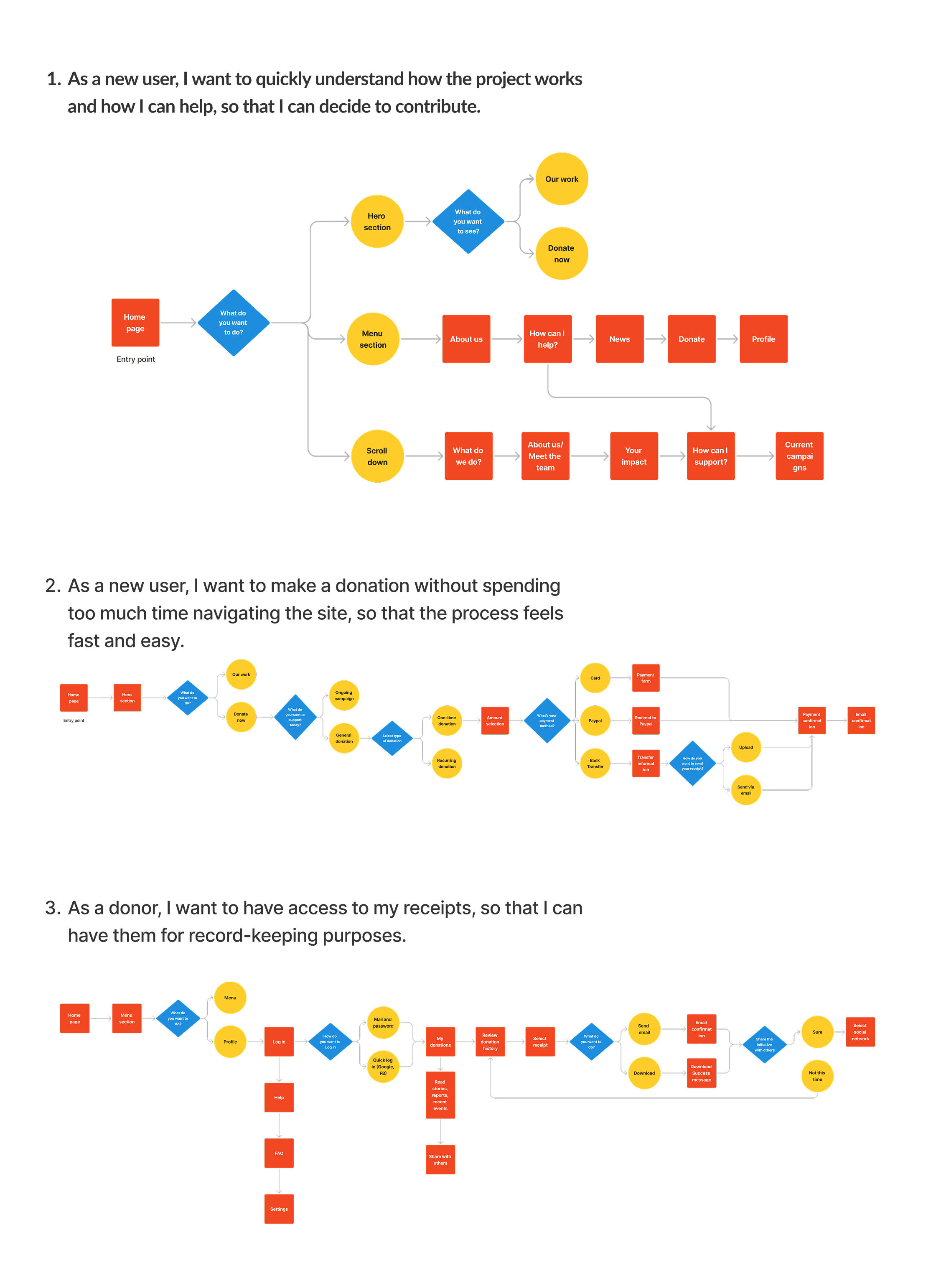
User Personas & User Flows
Design
Iterative Process
TEAM
Jozz Gomez
Deborah Howell (Mentor)
TIME
2024
8 weeks
SECTOR
NGO
Jump to Final UI


FIRST APPROACH
For the first design iteration, I translated research insights into low-fidelity sketches to define the core structure of the experience. My focus was on simplifying the donation journey and improving clarity between key choices. For example, I reduced the number of action buttons and created a clearer distinction between monthly vs. one-time donations, addressing users’ need for transparency and speed while supporting the NGO’s recurring-donation goals.
Beyond the flow itself, I explored how the site could better reflect Mi Valedor’s mission and build trust. The homepage concept prioritized storytelling, using cards to make ongoing projects, events, and campaigns more legible at a glance. I also drafted an account dashboard where users could sign in, review past contributions, and access receipts, features aimed at reinforcing trust and encouraging long-term engagement.

MID-FIDELITY
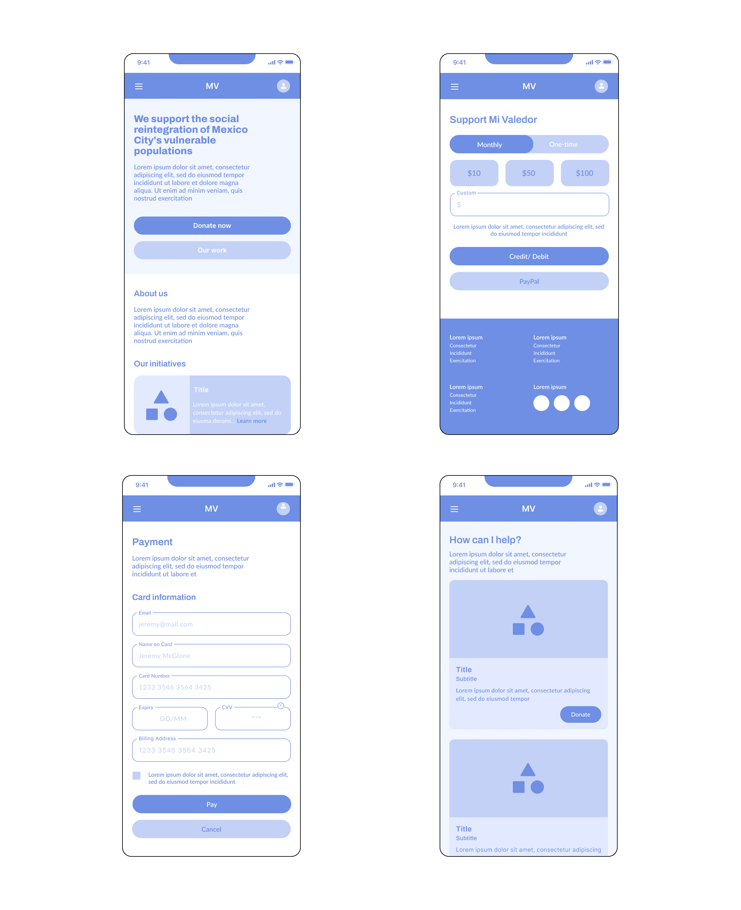
I began with the mobile experience to ensure a strong foundation for scalability, exploring different ways to structure the homepage and donation flow. A key challenge was deciding what users should see first to build trust without overwhelming them. After testing variations, I prioritized a clear hero CTA to donate, followed by an “About Us” overview and a preview of current initiatives. This helped me balance credibility with action.
For the donation screens, I iterated on hierarchy, button styles, and input placement to make the process as seamless as possible. Payment forms were kept familiar to reduce friction and speed up completion. These prototypes allowed me to validate that users could move through the flow with clarity and confidence.

COLOR AND VISUAL EXPLORATION
To ensure the redesign stayed true to Mi Valedor’s identity while modernizing the experience, I explored two distinct moodboards.
Moodboard A paid tribute to the NGO’s original branding, keeping red as its emblematic color but adding pink and yellow accents to celebrate the artistic nature of the project. The references included engravings by José Guadalupe Posada -honoring Mexico’s revolutionary-era printmaking- and Orozco’s volcanoes, symbolizing strength and resilience.
Moodboard B took a different approach, aligning more closely with visual trends in donation platforms. I explored a fresh palette of lime green, orange, and dark brown, representing renewal, hope, and growth. The moodboard drew inspiration from recognizable donation brands like GoFundMe and Kickstarter. Typography was bold and modern, designed to give the impression of a determined, action-oriented project.
In the end, I selected Moodboard A for the final design. Red’s association with Mi Valedor was a key trust signal for returning donors, and maintaining that connection felt essential. Rather than radically changing the palette, I decided I would incorporate storytelling element through photos of valedores, their workshops, and magazine projects.

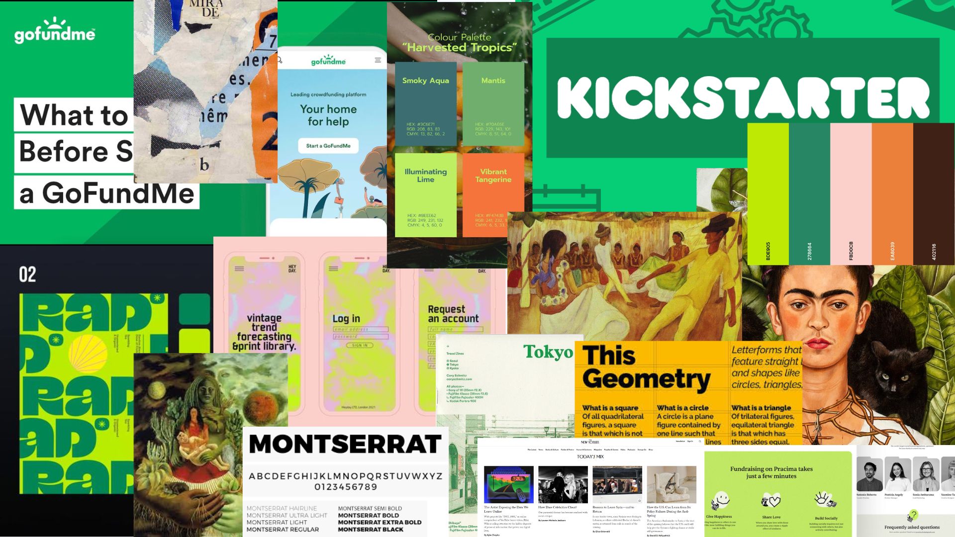
MOODBOARD B
MOODBOARD A

Final UI


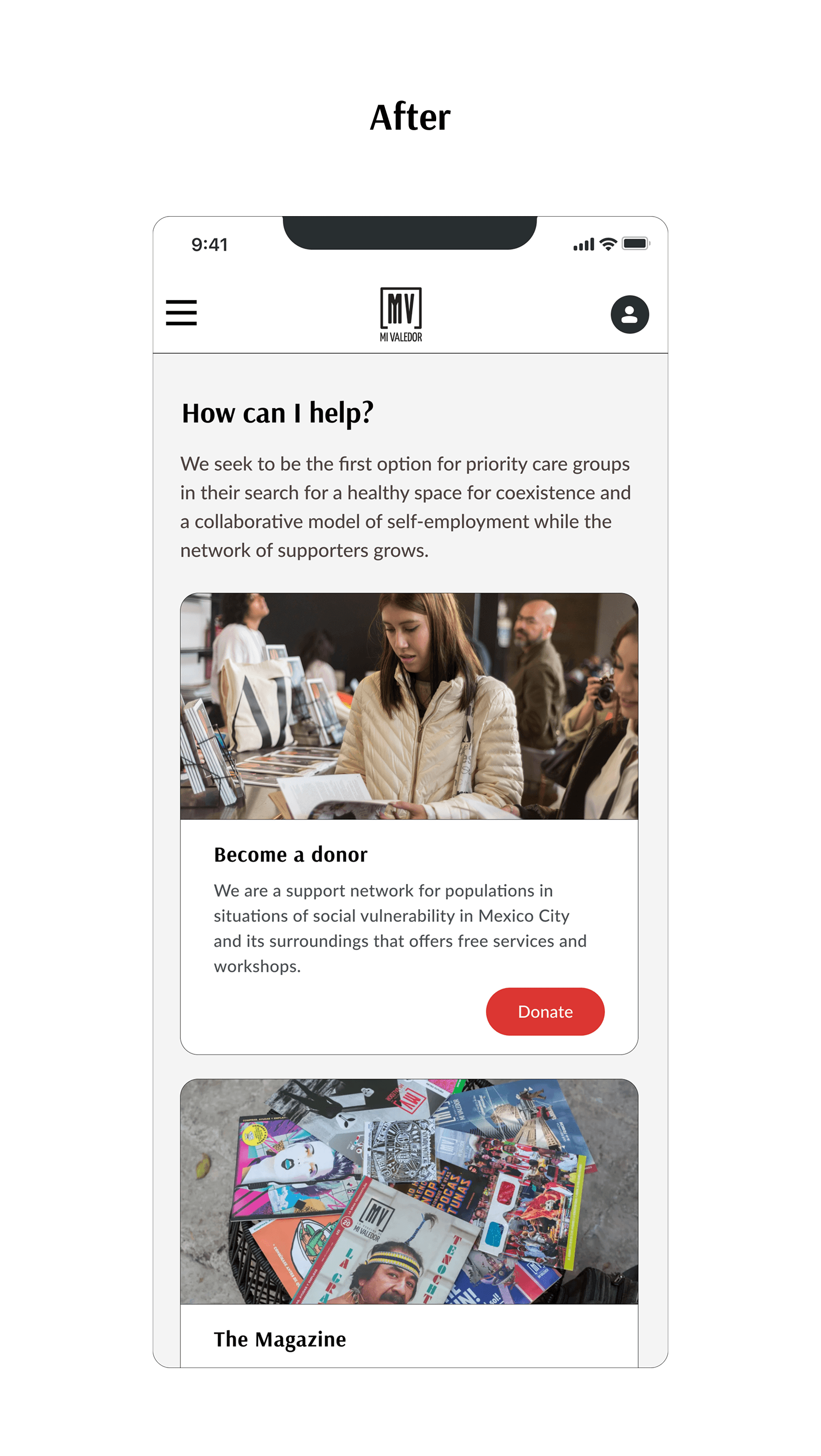


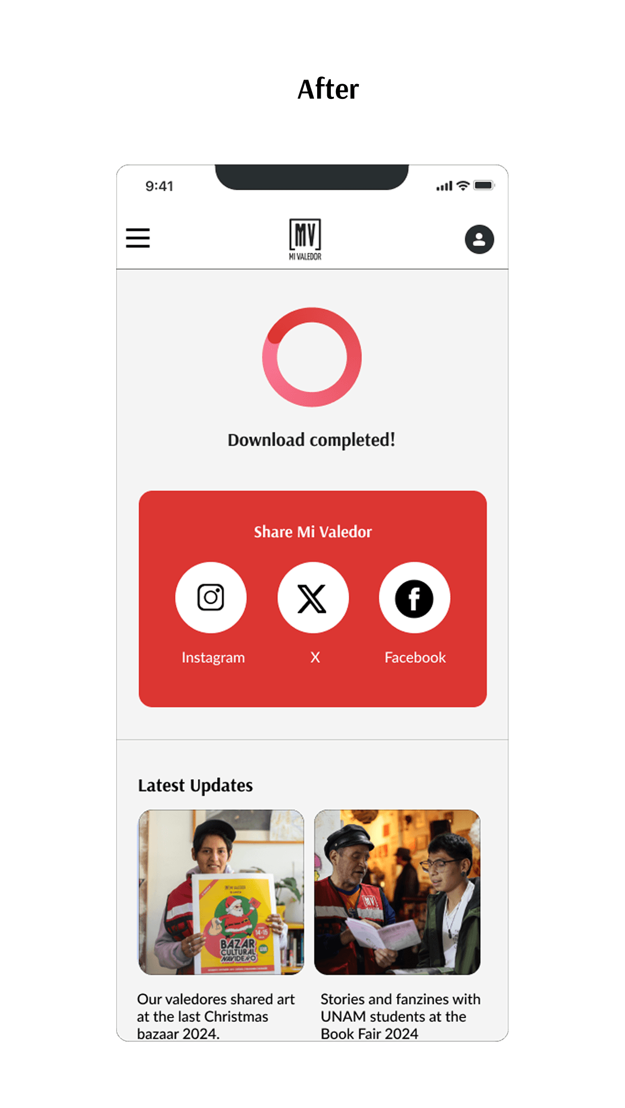

Users reported that the redesign reduced friction, helped them locate key actions faster, and increased confidence.
Boost in user satisfaction from post-test surveys, with participants noting that the donation process felt “clear and professional.”
Improvement in time-to-understanding thanks to the homepage redesign, making Mi Valedor’s mission clear within seconds.
"I feel like I understand the project so much better now. Seeing the initiatives and their results makes me confident my donation is making a real difference."
Angela Estrada, Culture and Communications Manager
"I trust this site now; it feels professional and secure compared to before."
Nico Cohen, Account Representative

Thanks!
Thanks so much for taking the time to view my portfolio.