WORK

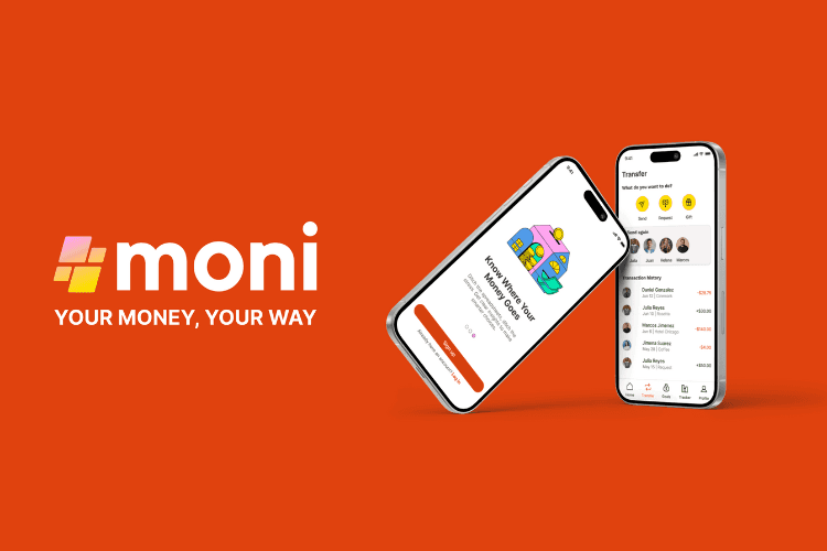

MONI: Creating a seamless and enjoyable financial experience for millennials
MONI: Creating a seamless and enjoyable financial experience for millennials
WORKFLOW
Market Research
Research Interviews
User Personas & User Flows
Design
Usability Testing
Iterative Process
TEAM
Jozz Gomez
Liz Cole (Mentor)
Caitlin Crow (Tutor)
TIME
2024
9 months
SECTOR
FINTECH
Overview
The growth in internet usage and the 2020 global pandemic have changed everyone’s financial behavior: we shop more online, visit the store less, and are even cautious about using our cards on the payment terminal. We want to do everything online, using a multitude of different devices.
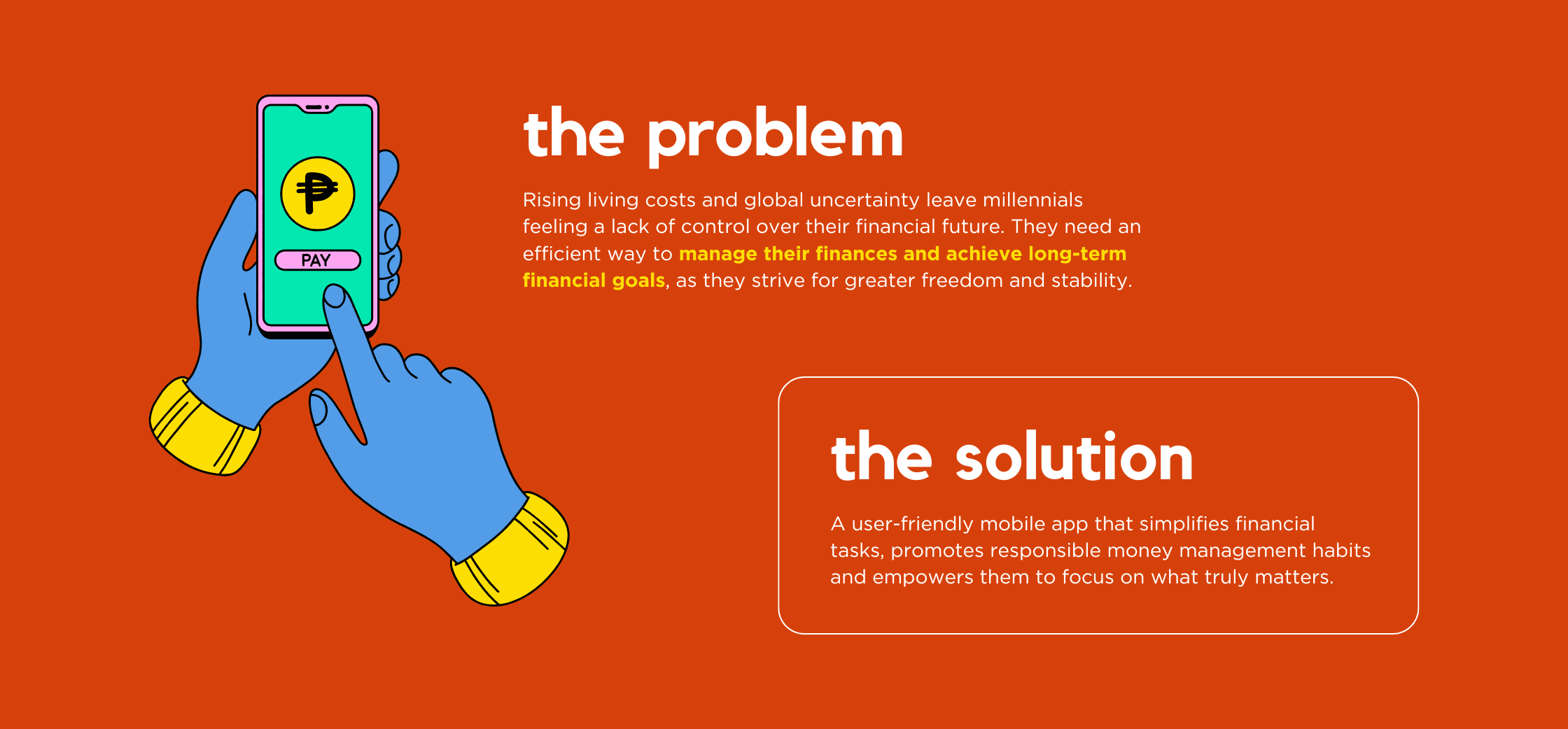
As part of my largest UX bootcamp project, I was given the challenge of designing an app that would function as both a secure bank account and a transactional card for payments and transfers. The project had some specific design goals: I needed to create something that addressed a particular use case, included strong security features, was functional and easy to use, and could be versatile enough for multiple purposes.
Drawing from my LATAM background, I focused on designing a solution that tackled common financial challenges, like limited access to banking services and concerns about online security. I tailored MONI to meet the needs of users in regions facing these issues.
Overview
The growth in internet usage and the 2020 global pandemic have changed everyone’s financial behavior: we shop more online, visit the store less, and are even cautious about using our cards on the payment terminal. We want to do everything online, using a multitude of different devices.
As part of my largest UX bootcamp project, I was given the challenge of designing an app that would function as both a secure bank account and a transactional card for payments and transfers. The project had some specific design goals: I needed to create something that addressed a particular use case, included strong security features, was functional and easy to use, and could be versatile enough for multiple purposes.
Drawing from my LATAM background, I focused on designing a solution that tackled common financial challenges, like limited access to banking services and concerns about online security. I tailored MONI to meet the needs of users in regions facing these issues.
Overview
The growth in internet usage and the 2020 global pandemic have changed everyone’s financial behavior: we shop more online, visit the store less, and are even cautious about using our cards on the payment terminal. We want to do everything online, using a multitude of different devices.
As part of my largest UX bootcamp project, I was given the challenge of designing an app that would function as both a secure bank account and a transactional card for payments and transfers. The project had some specific design goals: I needed to create something that addressed a particular use case, included strong security features, was functional and easy to use, and could be versatile enough for multiple purposes.
Drawing from my LATAM background, I focused on designing a solution that tackled common financial challenges, like limited access to banking services and concerns about online security. I tailored MONI to meet the needs of users in regions facing these issues.
Numbers Don't Lie
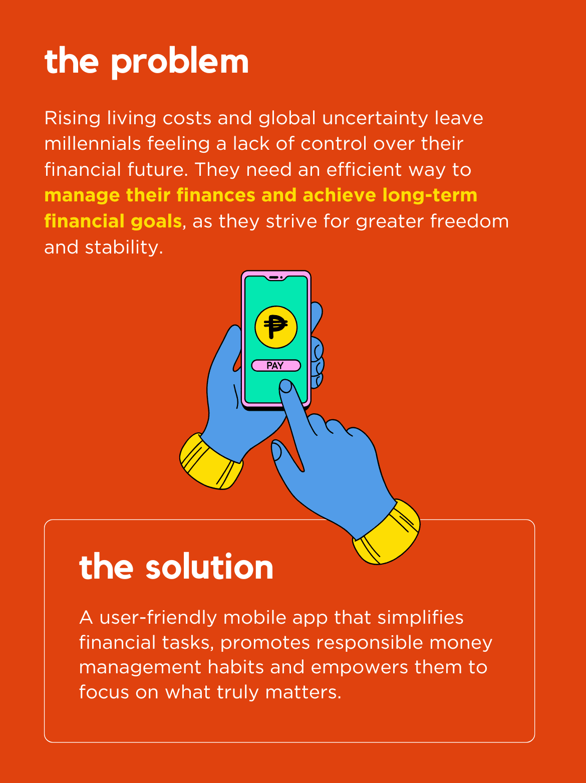
Growing up in a culture where money conversations are often avoided, I witnessed a shift—especially after the pandemic—as young people became increasingly anxious about their financial well-being and future stability. This sparked my curiosity. Were these concerns widespread or just anecdotal? To get to the root of the issue, I decided to dig into the data and uncover insights that would shape the direction of this project.
Numbers Don't Lie
Growing up in a culture where money conversations are often avoided, I witnessed a shift—especially after the pandemic—as young people became increasingly anxious about their financial well-being and future stability. This sparked my curiosity. Were these concerns widespread or just anecdotal? To get to the root of the issue, I decided to dig into the data and uncover insights that would shape the direction of this project.
Numbers Don't Lie
Growing up in a culture where money conversations are often avoided, I witnessed a shift—especially after the pandemic—as young people became increasingly anxious about their financial well-being and future stability. This sparked my curiosity. Were these concerns widespread or just anecdotal? To get to the root of the issue, I decided to dig into the data and uncover insights that would shape the direction of this project.
The Process
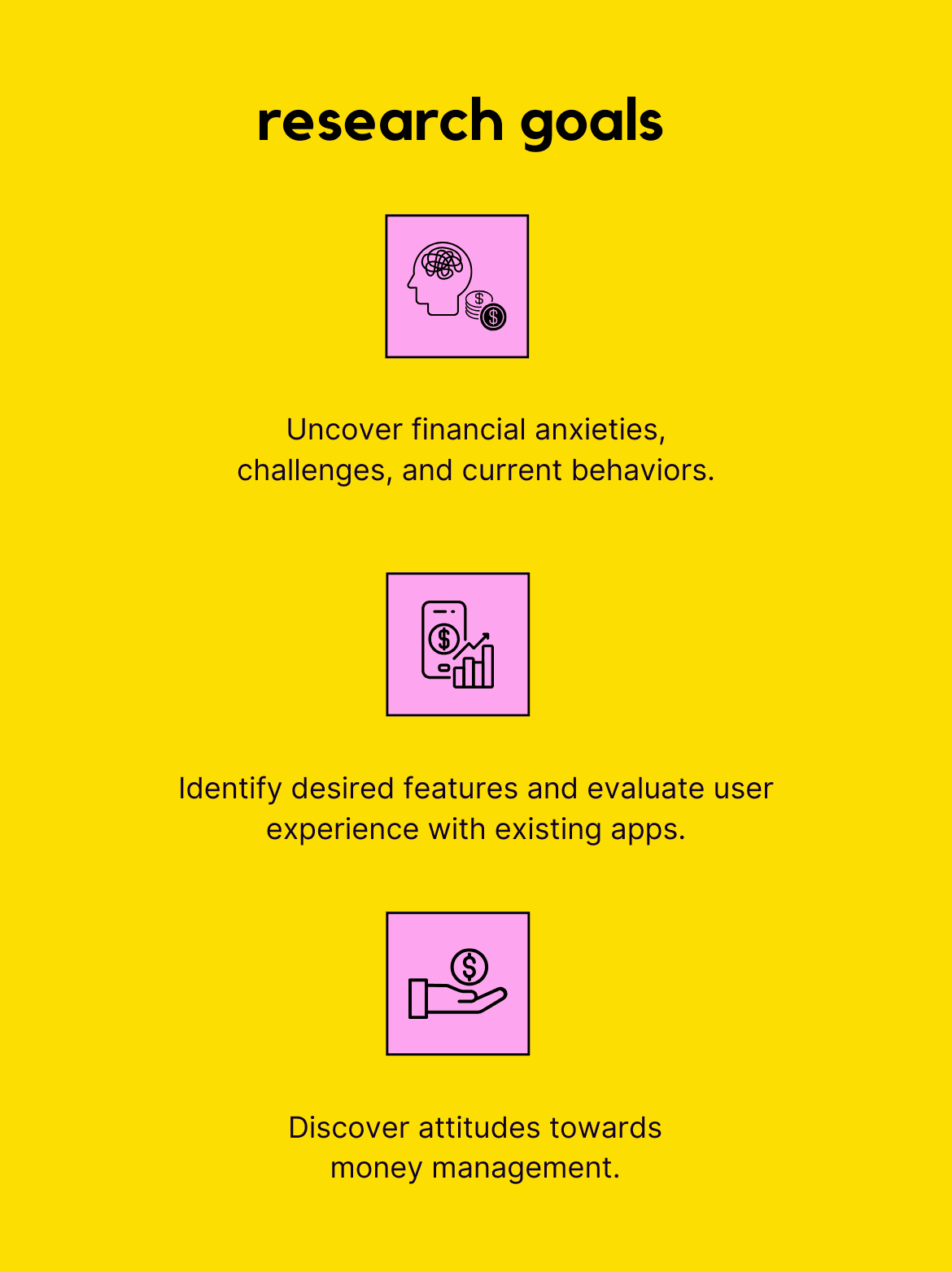
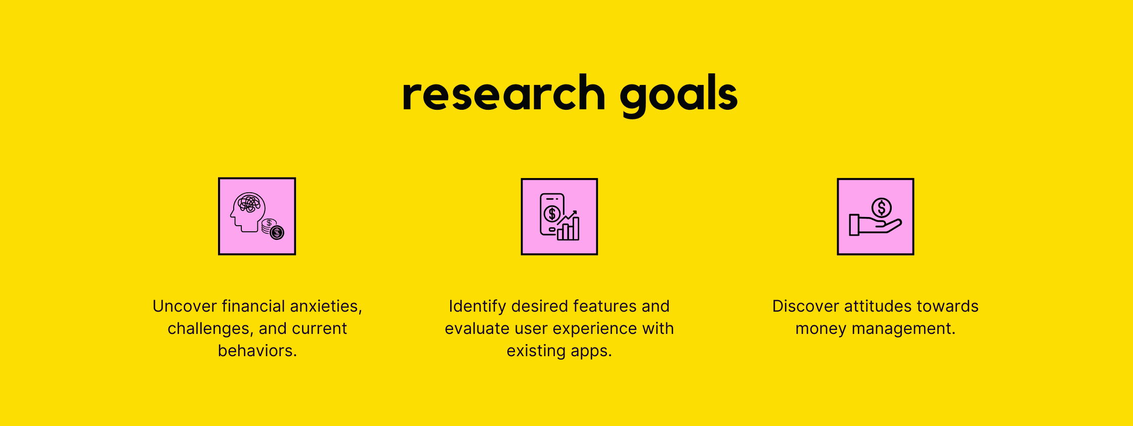
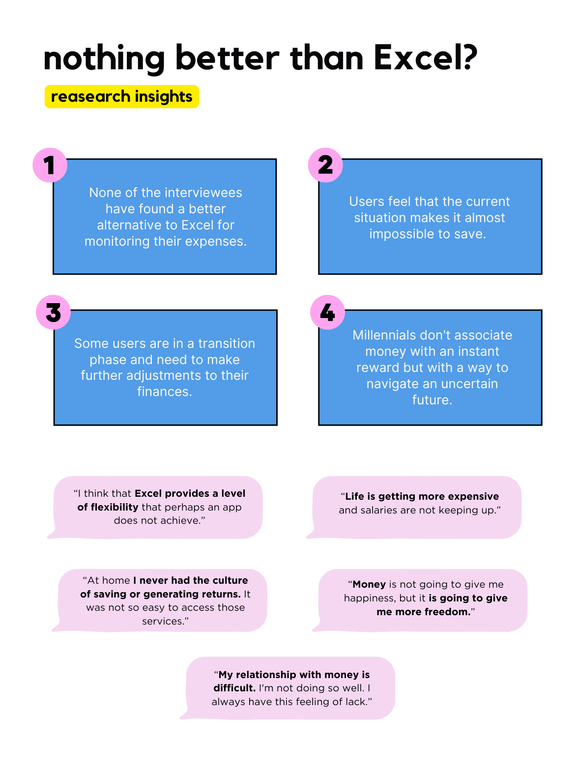
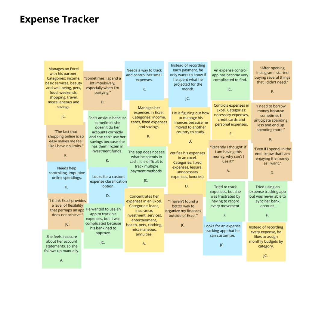
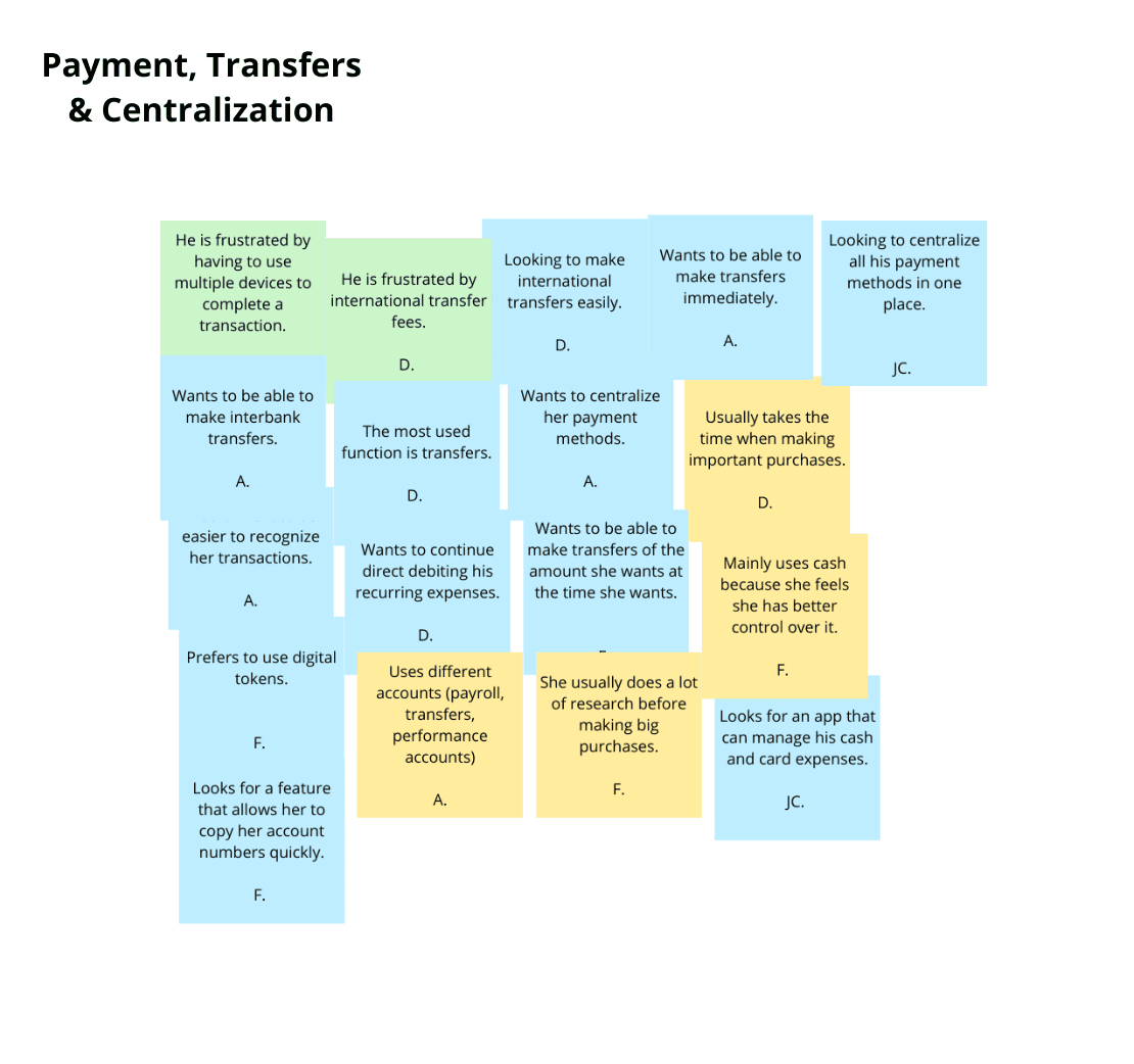
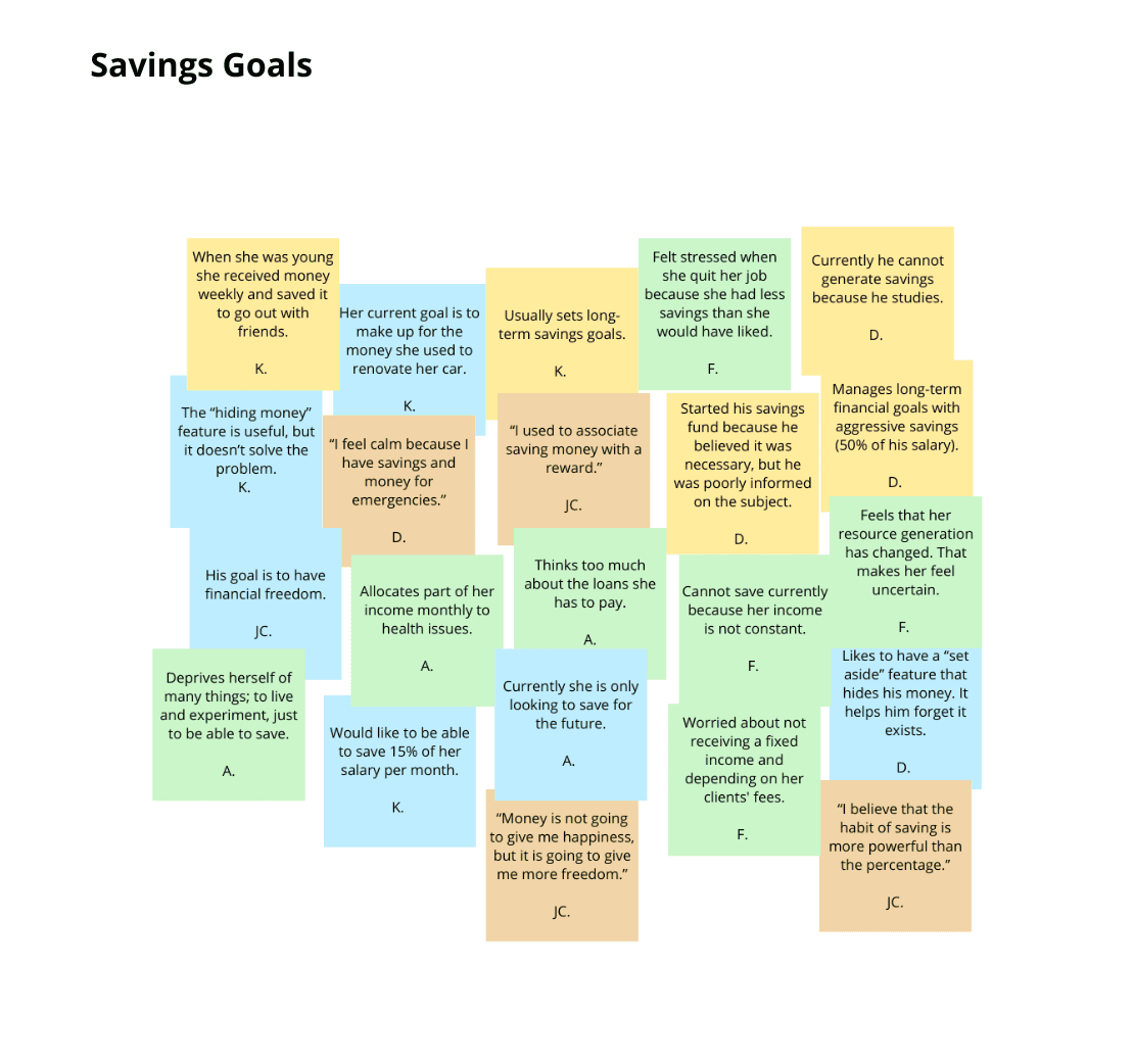
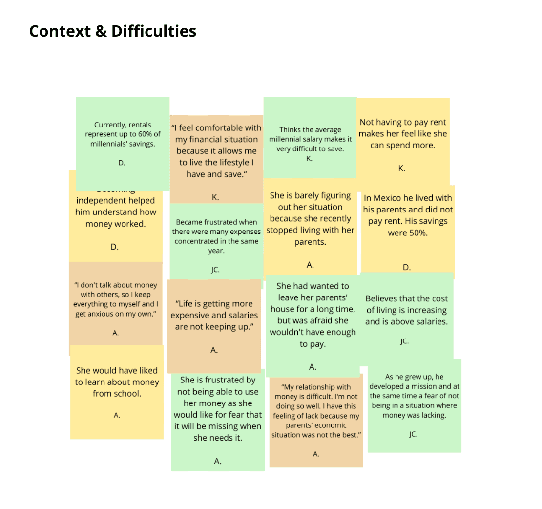
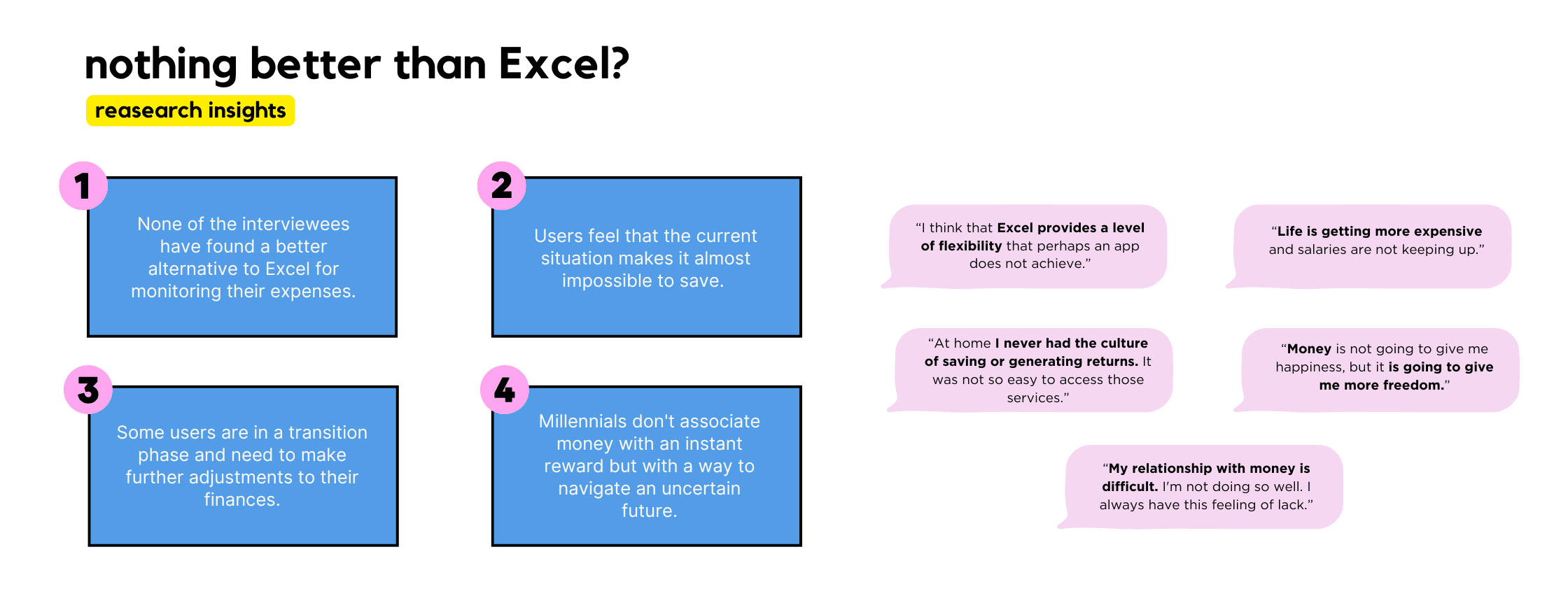
To identify the key financial concerns of my target demographic, I focused on three main research areas. I then interviewed five Latin American millennials aged 30-35 who actively use fintech apps. The findings were categorized into eight clusters, with the most significant ones presented here.
While my research was centered on Latin America, I believe the insights gained can be applied globally to address the needs of young adults worldwide.
The Process
To identify the key financial concerns of my target demographic, I focused on three main research areas. I then interviewed five Latin American millennials aged 30-35 who actively use fintech apps. The findings were categorized into eight clusters, with the most significant ones presented here.
While my research was centered on Latin America, I believe the insights gained can be applied globally to address the needs of young adults worldwide.
The Process
To identify the key financial concerns of my target demographic, I focused on three main research areas. I then interviewed five Latin American millennials aged 30-35 who actively use fintech apps. The findings were categorized into eight clusters, with the most significant ones presented here.
While my research was centered on Latin America, I believe the insights gained can be applied globally to address the needs of young adults worldwide.
interviews
Interviews
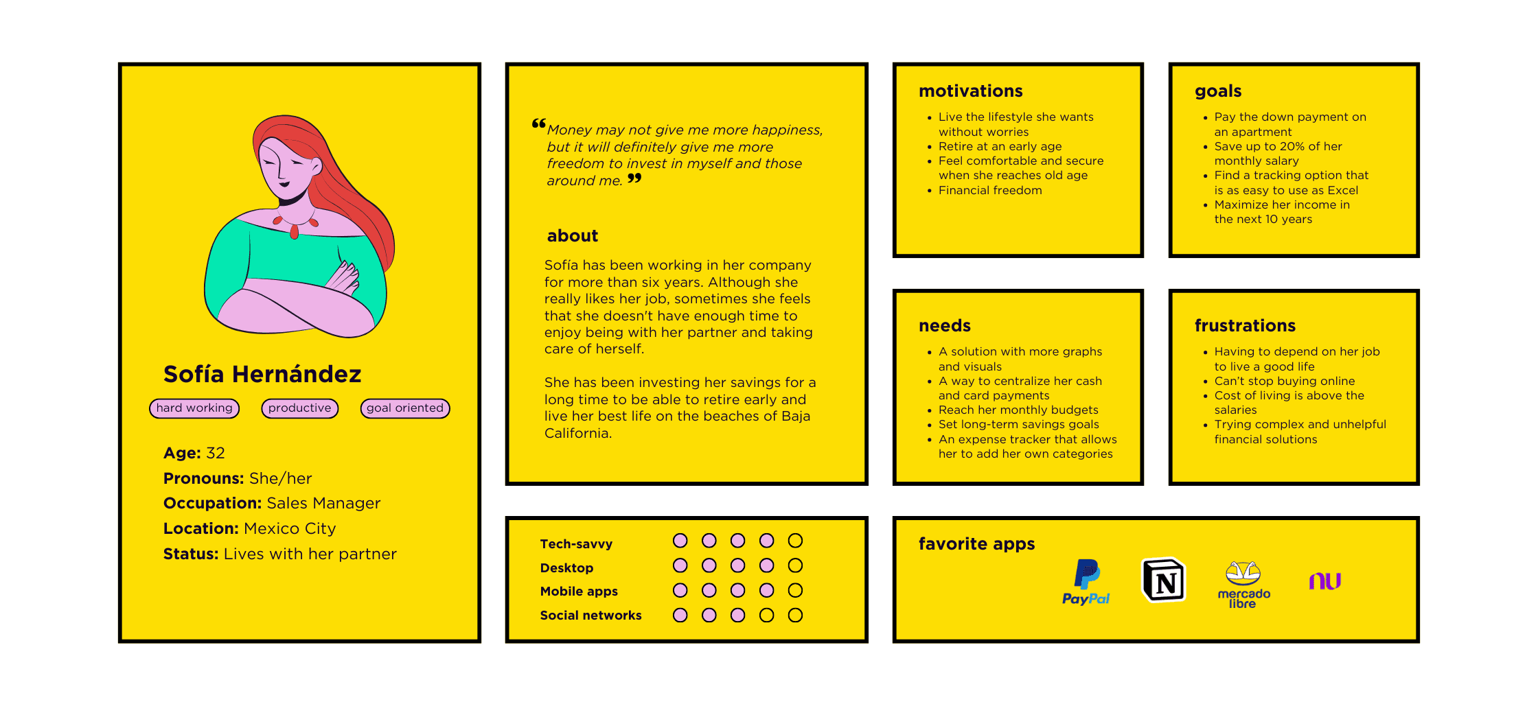
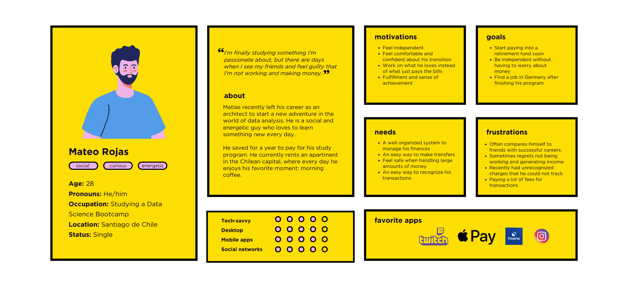
Meet Sofía and Mateo!
Based on the research findings, I created two personas representing key target groups:
The Stable Earners: These individuals have secure jobs but are proactively planning for their future, seeking to make informed decisions about saving and financial tracking.
The Financially Stretched: This group has experienced recent life changes that have impacted their income. Their primary concern is managing their current expenses and building a financial safety net.
These personas provided deeper insight into their goals, needs, motivations, and pain points, allowing me to design more tailored solutions that effectively address their specific requirements.
Meet Sofía and Mateo!
Based on the research findings, I created two personas representing key target groups:
The Stable Earners: These individuals have secure jobs but are proactively planning for their future, seeking to make informed decisions about saving and financial tracking.
The Financially Stretched: This group has experienced recent life changes that have impacted their income. Their primary concern is managing their current expenses and building a financial safety net.
These personas provided deeper insight into their goals, needs, motivations, and pain points, allowing me to design more tailored solutions that effectively address their specific requirements.
Meet Sofía and Mateo!
Based on the research findings, I created two personas representing key target groups:
The Stable Earners: These individuals have secure jobs but are proactively planning for their future, seeking to make informed decisions about saving and financial tracking.
The Financially Stretched: This group has experienced recent life changes that have impacted their income. Their primary concern is managing their current expenses and building a financial safety net.
These personas provided deeper insight into their goals, needs, motivations, and pain points, allowing me to design more tailored solutions that effectively address their specific requirements.
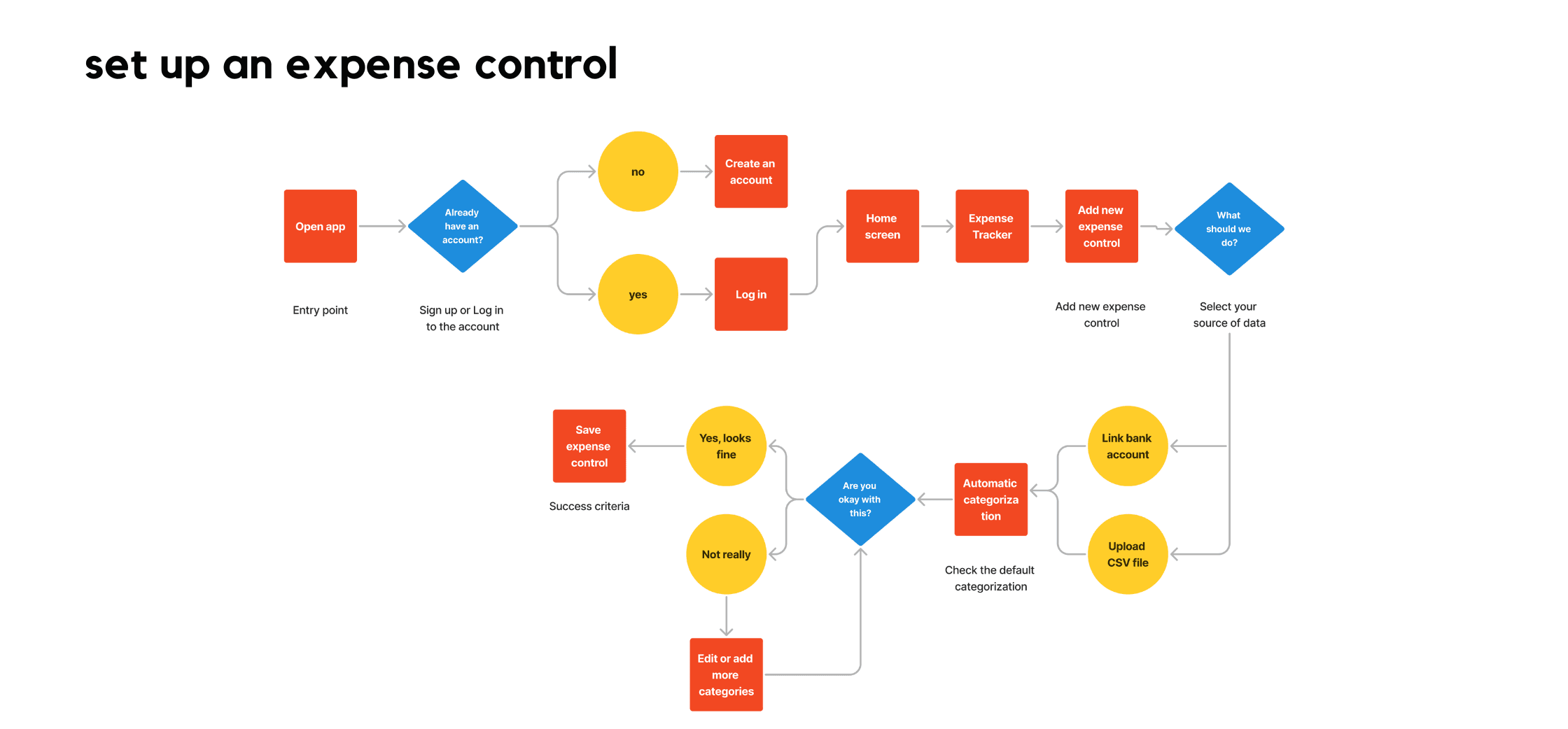
User Flows
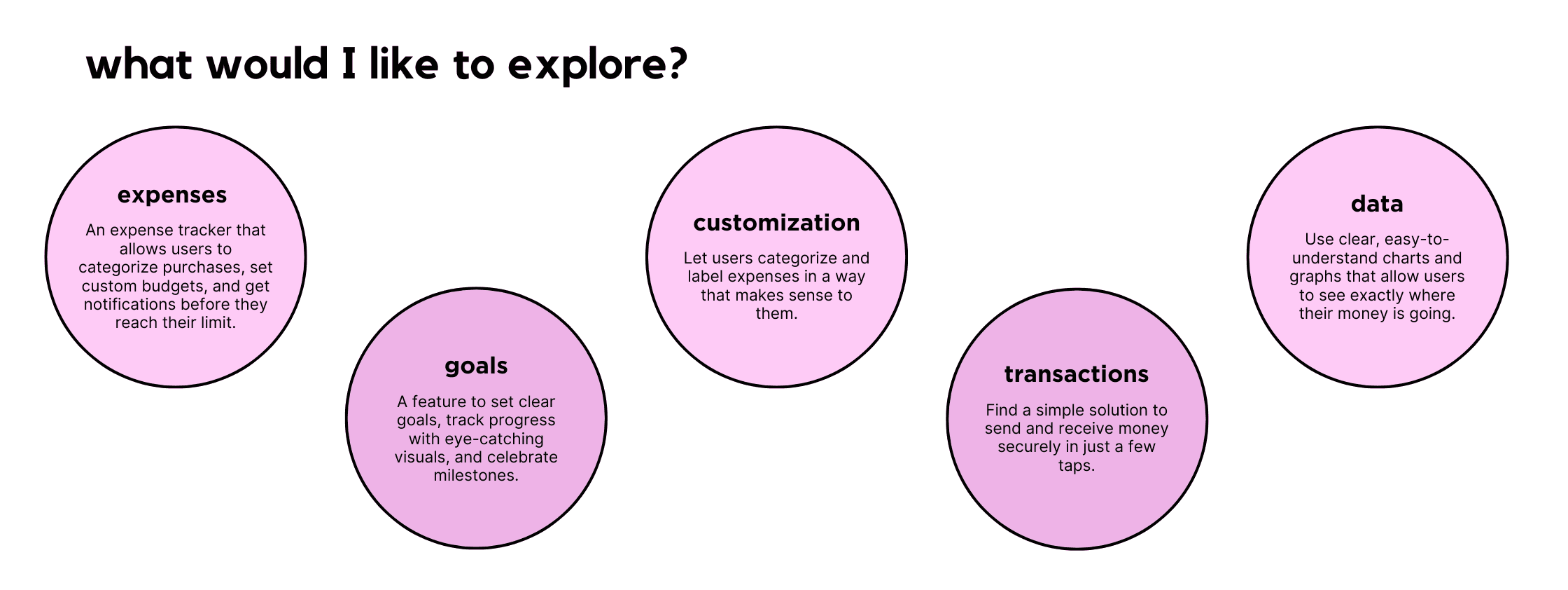
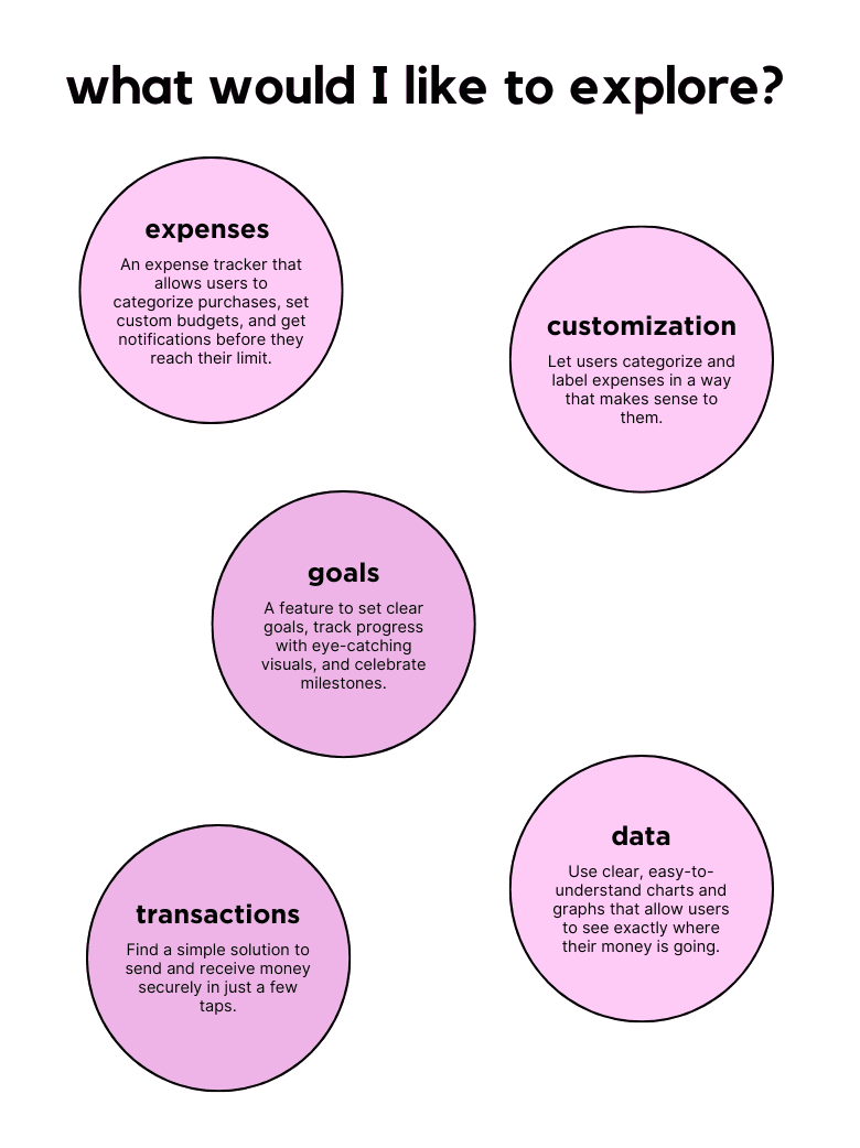
By mapping user flows for Mateo and Sofía, I was able to gain a deep understanding of their interactions with the product. This allowed me to visualize their potential paths when completing specific tasks.
User Flows
By mapping user flows for Mateo and Sofía, I was able to gain a deep understanding of their interactions with the product. This allowed me to visualize their potential paths when completing specific tasks.
User Flows
By mapping user flows for Mateo and Sofía, I was able to gain a deep understanding of their interactions with the product. This allowed me to visualize their potential paths when completing specific tasks.

First Approach
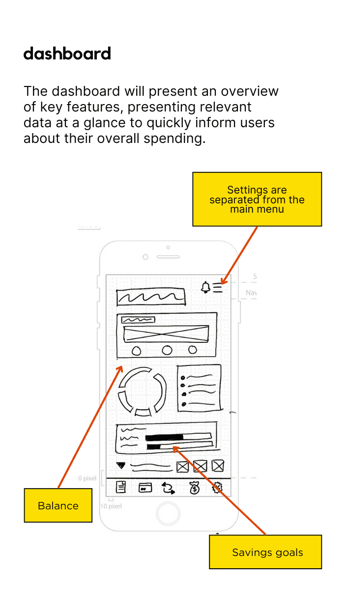
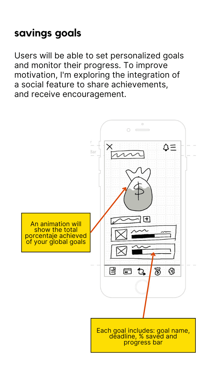
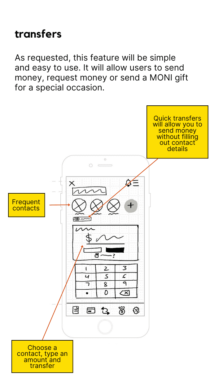
The initial sketches focused on creating a clean and intuitive interface. I incorporated visual elements and graphics to make information more engaging and easier to understand. A key challenge was designing efficient user flows that minimized the number of screens required to complete tasks, while also making numerical data more appealing to younger users.
First Approach
The initial sketches focused on creating a clean and intuitive interface. I incorporated visual elements and graphics to make information more engaging and easier to understand. A key challenge was designing efficient user flows that minimized the number of screens required to complete tasks, while also making numerical data more appealing to younger users.
First Approach
The initial sketches focused on creating a clean and intuitive interface. I incorporated visual elements and graphics to make information more engaging and easier to understand. A key challenge was designing efficient user flows that minimized the number of screens required to complete tasks, while also making numerical data more appealing to younger users.
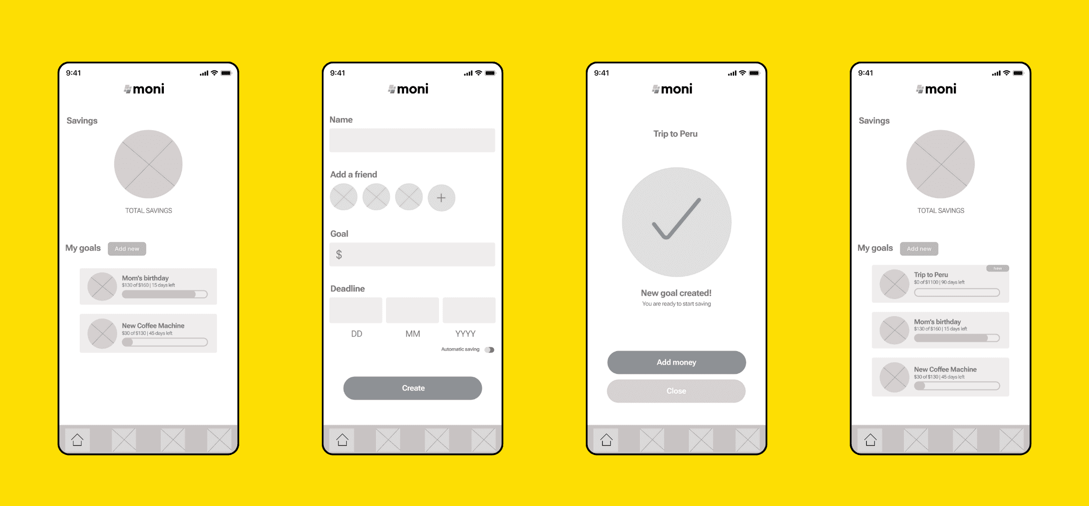
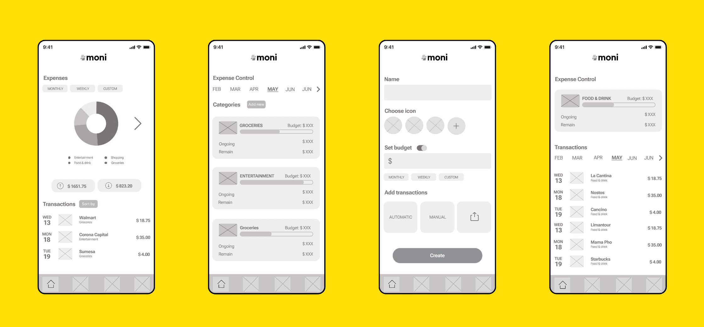
Mid-Fidelity
I brought my initial sketches to life using Figma. To maintain a clear focus, I opted for a grayscale color scheme, ensuring that the attention stayed on the user experience rather than aesthetics.
The biggest challenge was thoughtfully organizing elements on each screen while crafting a prototype that could effectively test MONI’s key features: robust security, engaging social interactions, and dynamic data visualizations.
Mid-Fidelity
I brought my initial sketches to life using Figma. To maintain a clear focus, I opted for a grayscale color scheme, ensuring that the attention stayed on the user experience rather than aesthetics.
The biggest challenge was thoughtfully organizing elements on each screen while crafting a prototype that could effectively test MONI’s key features: robust security, engaging social interactions, and dynamic data visualizations.
Mid-Fidelity
I brought my initial sketches to life using Figma. To maintain a clear focus, I opted for a grayscale color scheme, ensuring that the attention stayed on the user experience rather than aesthetics.
The biggest challenge was thoughtfully organizing elements on each screen while crafting a prototype that could effectively test MONI’s key features: robust security, engaging social interactions, and dynamic data visualizations.
Usability Test
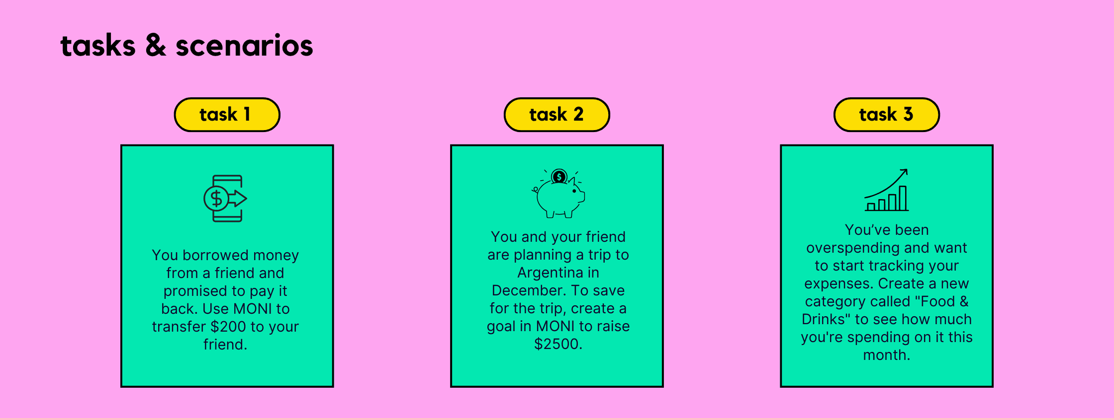
The project reached an exhilarating milestone: testing the prototype to see if it truly delivered on functionality and usability! Over the course of a week, six participants between the ages of 25 and 35, all eager to improve their financial habits, engaged with the app in a remote study.
We focused on four key objectives:
Evaluating how effortlessly users could navigate the core features.
Assessing their sense of trust and security during transactions.
Gauging how easily they could understand and extract insights from the graphs and statistics.
Measuring the effectiveness of the Expense Tracker tool.
Usability Test
The project reached an exhilarating milestone: testing the prototype to see if it truly delivered on functionality and usability! Over the course of a week, six participants between the ages of 25 and 35, all eager to improve their financial habits, engaged with the app in a remote study.
We focused on four key objectives:
Evaluating how effortlessly users could navigate the core features.
Assessing their sense of trust and security during transactions.
Gauging how easily they could understand and extract insights from the graphs and statistics.
Measuring the effectiveness of the Expense Tracker tool.
Usability Test
The project reached an exhilarating milestone: testing the prototype to see if it truly delivered on functionality and usability! Over the course of a week, six participants between the ages of 25 and 35, all eager to improve their financial habits, engaged with the app in a remote study.
We focused on four key objectives:
Evaluating how effortlessly users could navigate the core features.
Assessing their sense of trust and security during transactions.
Gauging how easily they could understand and extract insights from the graphs and statistics.
Measuring the effectiveness of the Expense Tracker tool.
test results
Iterations
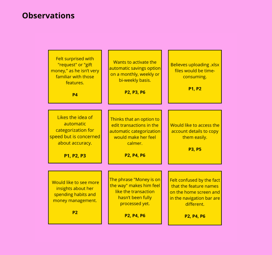
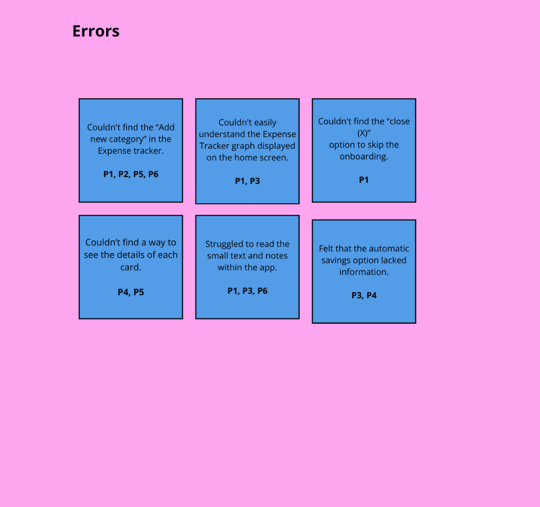
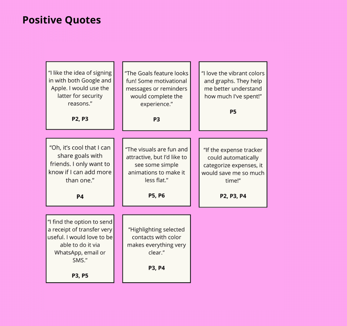
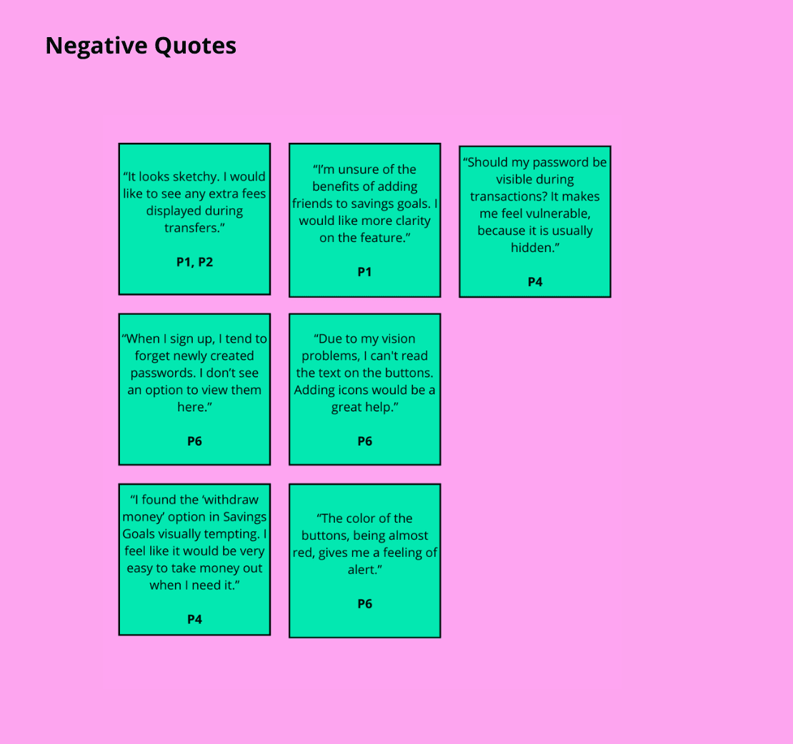
By analyzing the usability testing data using a Rainbow Spreadsheet and rating the errors using the Jakob Nielsen’s scale, I was able to uncover significant usability issues. Key findings included:
Accessibility challenges with font size and color combinations.
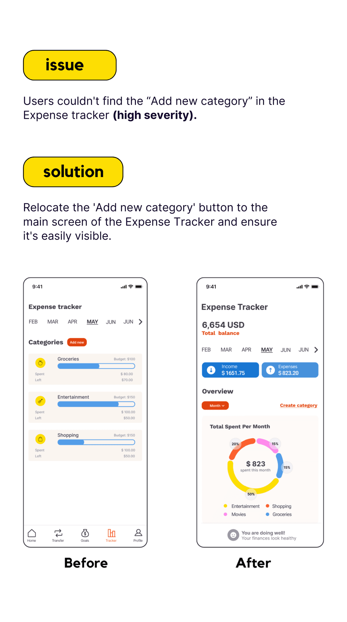
Difficulties with navigation, especially when trying to create new categories for the Expense Tracker.
The data visualizations proved to be a major pain point, as users struggled to understand the information presented.
Iterations
By analyzing the usability testing data using a Rainbow Spreadsheet and rating the errors using the Jakob Nielsen’s scale, I was able to uncover significant usability issues. Key findings included:
Accessibility challenges with font size and color combinations.
Difficulties with navigation, especially when trying to create new categories for the Expense Tracker.
The data visualizations proved to be a major pain point, as users struggled to understand the information presented.
Iterations
By analyzing the usability testing data using a Rainbow Spreadsheet and rating the errors using the Jakob Nielsen’s scale, I was able to uncover significant usability issues. Key findings included:
Accessibility challenges with font size and color combinations.
Difficulties with navigation, especially when trying to create new categories for the Expense Tracker.
The data visualizations proved to be a major pain point, as users struggled to understand the information presented.


Preference Test
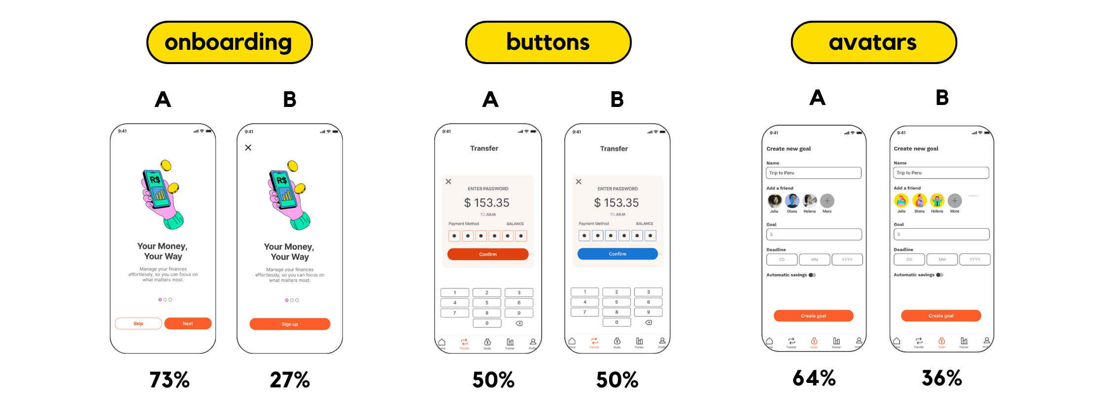
To gather additional insights, I conducted preference tests with 8 users using Lyssna. I focused on three key areas: onboarding, color, and avatars.
While users were indifferent between orange and blue for the app's color scheme, I decided to stick with orange for its unique and playful appeal. Surprisingly, despite my personal preference for illustrated avatars, 64% of users indicated a strong preference for real photos, suggesting that they valued a more personal connection.
Preference Test
To gather additional insights, I conducted preference tests with 8 users using Lyssna. I focused on three key areas: onboarding, color, and avatars.
While users were indifferent between orange and blue for the app's color scheme, I decided to stick with orange for its unique and playful appeal. Surprisingly, despite my personal preference for illustrated avatars, 64% of users indicated a strong preference for real photos, suggesting that they valued a more personal connection.
Preference Test
To gather additional insights, I conducted preference tests with 8 users using Lyssna. I focused on three key areas: onboarding, color, and avatars.
While users were indifferent between orange and blue for the app's color scheme, I decided to stick with orange for its unique and playful appeal. Surprisingly, despite my personal preference for illustrated avatars, 64% of users indicated a strong preference for real photos, suggesting that they valued a more personal connection.

Style Guide
I developed a style guide that captures MONI's fun and vibrant approach to fintech. The design elements are clean and modern, featuring vibrant colors, easy-to-read typography, and universally understood icons.
Style Guide
I developed a style guide that captures MONI's fun and vibrant approach to fintech. The design elements are clean and modern, featuring vibrant colors, easy-to-read typography, and universally understood icons.
Style Guide
I developed a style guide that captures MONI's fun and vibrant approach to fintech. The design elements are clean and modern, featuring vibrant colors, easy-to-read typography, and universally understood icons.

MONI: Before & After
MONI: Before & After
To conduct user interviews, I followed a structured approach that involved identifying the target audience, creating a set of relevant open-ended questions, and engaging in one-on-one conversations to gather valuable insights and feedback regarding their experiences, needs, and preferences.
MONI: Before & After
To conduct user interviews, I followed a structured approach that involved identifying the target audience, creating a set of relevant open-ended questions, and engaging in one-on-one conversations to gather valuable insights and feedback regarding their experiences, needs, and preferences.
Onboarding & Home
The onboarding process was refined to better reflect MONI's brand identity. Users appreciated the engaging visual style, simplified language, and convenient sign-up options.
The dashboard was redesigned to provide a clearer overview of financial information. I also made accessibility a priority by adding zoom functionality and easy access to transfers.
Onboarding & Home
The onboarding process was refined to better reflect MONI's brand identity. Users appreciated the engaging visual style, simplified language, and convenient sign-up options.
The dashboard was redesigned to provide a clearer overview of financial information. I also made accessibility a priority by adding zoom functionality and easy access to transfers.
Onboarding & Home
The onboarding process was refined to better reflect MONI's brand identity. Users appreciated the engaging visual style, simplified language, and convenient sign-up options.
The dashboard was redesigned to provide a clearer overview of financial information. I also made accessibility a priority by adding zoom functionality and easy access to transfers.
Transfers
Currently, there are many options that make money transfers easy and do the job well. MONI followed that same approach but placed special emphasis on security and offering more specific actions for different types of transfers, such as Send, Request, or Gift.
In the latest iteration, based on user feedback, I decided that password authentication would only be required for transactions over 100, allowing users to make quick transfers for smaller amounts.
In terms of data presentation, an initial screen was also created to allow users to access their transfer history and quickly view a visual summary of their incoming and outgoing funds.
Transfers
Currently, there are many options that make money transfers easy and do the job well. MONI followed that same approach but placed special emphasis on security and offering more specific actions for different types of transfers, such as Send, Request, or Gift.
In the latest iteration, based on user feedback, I decided that password authentication would only be required for transactions over 100, allowing users to make quick transfers for smaller amounts.
In terms of data presentation, an initial screen was also created to allow users to access their transfer history and quickly view a visual summary of their incoming and outgoing funds.
Transfers
Currently, there are many options that make money transfers easy and do the job well. MONI followed that same approach but placed special emphasis on security and offering more specific actions for different types of transfers, such as Send, Request, or Gift.
In the latest iteration, based on user feedback, I decided that password authentication would only be required for transactions over 100, allowing users to make quick transfers for smaller amounts.
In terms of data presentation, an initial screen was also created to allow users to access their transfer history and quickly view a visual summary of their incoming and outgoing funds.
Savings Goals
My initial research showed that users were looking for a way to save money but lacked the tools to set and track their goals. MONI's Goals feature was created to fill this gap. By allowing users to set shared savings goals and automate their savings, MONI has provided them with a powerful tool to achieve their financial objectives. User feedback has been overwhelmingly positive, highlighting the ease of use and the motivational benefits of collaborative goal setting.
Savings Goals
My initial research showed that users were looking for a way to save money but lacked the tools to set and track their goals. MONI's Goals feature was created to fill this gap. By allowing users to set shared savings goals and automate their savings, MONI has provided them with a powerful tool to achieve their financial objectives. User feedback has been overwhelmingly positive, highlighting the ease of use and the motivational benefits of collaborative goal setting.
Savings Goals
My initial research showed that users were looking for a way to save money but lacked the tools to set and track their goals. MONI's Goals feature was created to fill this gap. By allowing users to set shared savings goals and automate their savings, MONI has provided them with a powerful tool to achieve their financial objectives. User feedback has been overwhelmingly positive, highlighting the ease of use and the motivational benefits of collaborative goal setting.
Expense Tracker
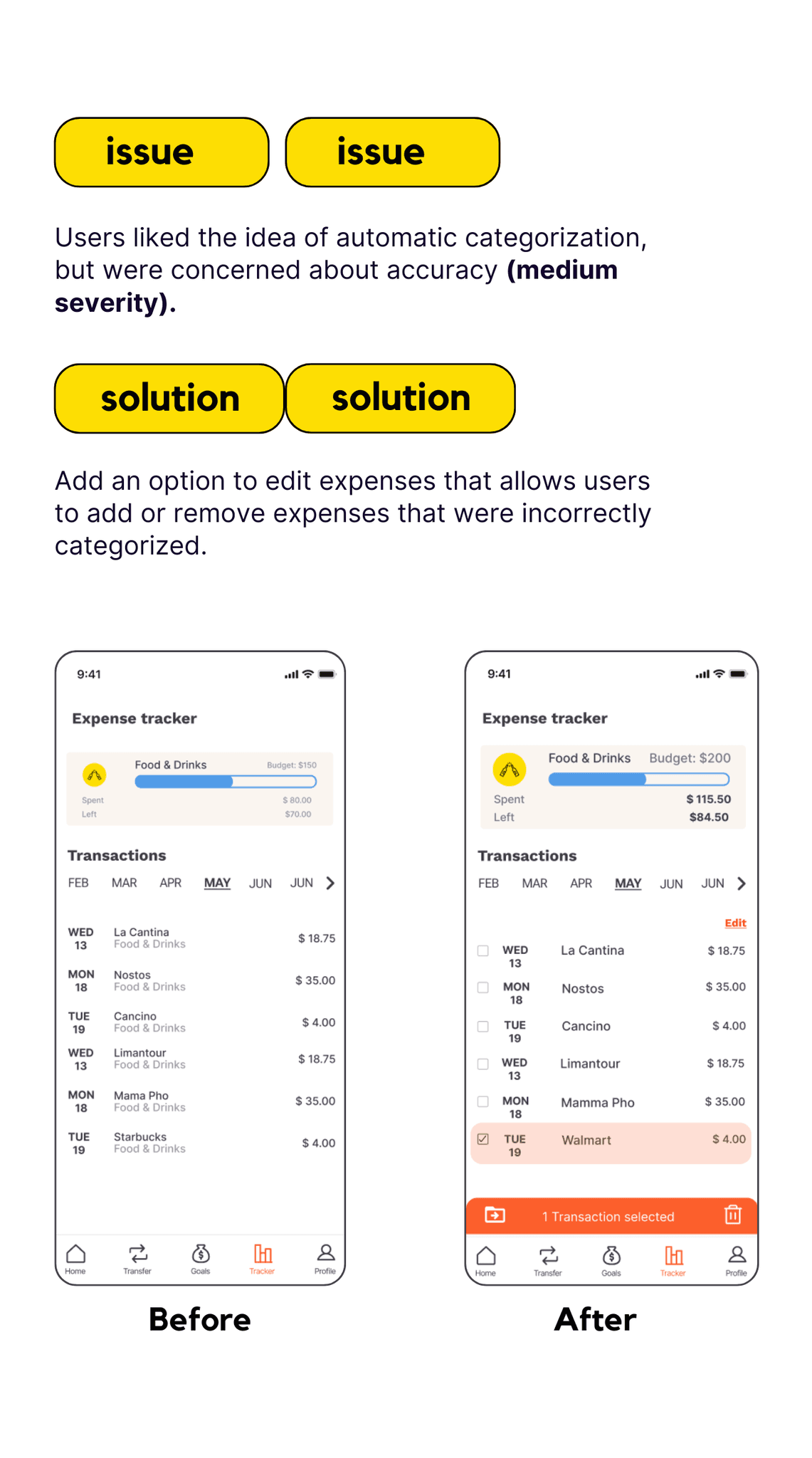
Users were excited about MONI's automated transaction categorization feature, but they expressed concerns about its accuracy. To address these concerns, I introduced a manual review and edit feature. This added control made 100% of surveyed users feel more confident in the system.
While MONI continues to use the bank's categorization system alongside the manual option, my goal is to eventually build a team to develop an in-house algorithm for more accurate, low-error categorization.
Expense Tracker
Users were excited about MONI's automated transaction categorization feature, but they expressed concerns about its accuracy. To address these concerns, I introduced a manual review and edit feature. This added control made 100% of surveyed users feel more confident in the system.
While MONI continues to use the bank's categorization system alongside the manual option, my goal is to eventually build a team to develop an in-house algorithm for more accurate, low-error categorization.
Expense Tracker
Users were excited about MONI's automated transaction categorization feature, but they expressed concerns about its accuracy. To address these concerns, I introduced a manual review and edit feature. This added control made 100% of surveyed users feel more confident in the system.
While MONI continues to use the bank's categorization system alongside the manual option, my goal is to eventually build a team to develop an in-house algorithm for more accurate, low-error categorization.
What's Next?
Just a few years ago, financial apps lacked the creativity and user-friendliness they deserved. I’m excited to be part of a time when this is changing, as institutions are beginning to understand the importance of speaking the users’ language and offering more interesting and fresh solutions. I’m glad I seized the opportunity to propose a more engaging and enjoyable way to interact with money through this app. But this effort doesn’t end here.
Looking ahead, there are several areas I’d like to expand on in MONI's features:
What's Next?
Just a few years ago, financial apps lacked the creativity and user-friendliness they deserved. I’m excited to be part of a time when this is changing, as institutions are beginning to understand the importance of speaking the users’ language and offering more interesting and fresh solutions. I’m glad I seized the opportunity to propose a more engaging and enjoyable way to interact with money through this app. But this effort doesn’t end here.
Looking ahead, there are several areas I’d like to expand on in MONI's features:
What's Next?
Just a few years ago, financial apps lacked the creativity and user-friendliness they deserved. I’m excited to be part of a time when this is changing, as institutions are beginning to understand the importance of speaking the users’ language and offering more interesting and fresh solutions. I’m glad I seized the opportunity to propose a more engaging and enjoyable way to interact with money through this app. But this effort doesn’t end here.
Looking ahead, there are several areas I’d like to expand on in MONI's features:
social features
Designing a user-friendly flow that clearly explains what happens when a goal is shared, including notifications for contributions and ways to encourage consistent savings from all participants.
data-driven insights
Improving data visualization and analytics to give users deeper financial insights and actionable recommendations.
badges and reminders
Boosting motivation through badges and reminders to celebrate milestones. For this, I’d like to draw inspiration from apps like Duolingo, which have perfected gamification and user motivation.
social features
Designing a user-friendly flow that clearly explains what happens when a goal is shared, including notifications for contributions and ways to encourage consistent savings from all participants.
data-driven insights
Improving data visualization and analytics to give users deeper financial insights and actionable recommendations.
badges and reminders
social features
Boosting motivation through badges and reminders to celebrate milestones. For this, I’d like to draw inspiration from apps like Duolingo, which have perfected gamification and user motivation.
Designing a user-friendly flow that clearly explains what happens when a goal is shared, including notifications for contributions and ways to encourage consistent savings from all participants.
data-driven insights
Improving data visualization and analytics to give users deeper financial insights and actionable recommendations.
badges and reminders
Boosting motivation through badges and reminders to celebrate milestones. For this, I’d like to draw inspiration from apps like Duolingo, which have perfected gamification and user motivation.
Thanks!
Thanks so much for taking the time to view my portfolio.